library(tidyverse)
library(palmerpenguins)

penguins <- palmerpenguins::penguins |>
  drop_na(sex)

model <- lm(
  body_mass_g ~ flipper_length_mm + bill_length_mm + bill_depth_mm + sex,
  data = penguins
)Sessions 7 and 8 tips and FAQs
FAQs
Hi everyone!
I have a few quick tips and tricks and suggestions here based on what you all did with sessions 7 and 8. Enjoy!
Is there some place I can find R packages? There are so many!
There are tens of thousands of R packages, and there’s no good way of knowing what’s out there. A lot of that is because packages are often created for some really specific niche statistical thing. While CRAN is the main respository of packages, it doesn’t really act like an app store and make suggestions.
There are some ways to find helpful packages though:
Word of mouth: You’ll often hear about packages in classes and workshops or reading stuff online. You can ask around and see what packages people like to use. You can also check the R Weekly newsletter, which includes a section of highlighting new or updated packages.
CRAN task views: While CRAN doesn’t formally act as an app store, it does invite experts to make curated lists of packages for specific tasks, which it calls CRAN Task Views. For instance, if you’re interested in doing causal inference, there are a bunch of packages with helpful tools in them.
Google: If you have a specific thing you want to do, you can search for “r package BLAH” on Google. For instance, if you want to access CDC data, you could hunt around their website for it, or you could search for “cdc data r package” and discover several CDC-related packages, like {EPHTrackR} and {CDCPLACES}
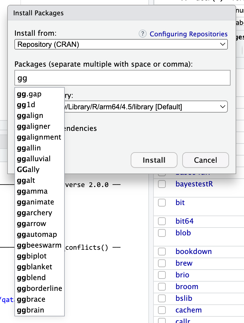
The install packages menu: This is actually kind of an oblique approach, but it’s surprisingly useful! Many packages fit within a larger ecosystem. For instance, you’ve been learning about the tidyverse, which is a collection of packages that all work together nicely. You’ve seen packages like {ggrepel} that extend {ggplot} to make nicer, non-overlapping labels. Package authors will try to name their packages to fit within the ecosystem they’re supposed to be in.
For example, notice how {ggrepel} starts with “gg”. The norm in the packages-that-extend-ggplot world is to use the “gg” prefix. If you go to the Packages panel in RStudio, then click on “Install packages” and start typing “gg”, you’ll see a ton of ggplot-related packages. I have no idea what most of these do (you can see {ggbeeswarm} there!), but they do something with ggplot. One of those packages is called {ggbrain}—it lets you plot brain images using ggplot. {ggarchery} sounds neat—it lets you make nicer arrows for annotating things.
Some packages that start with “gg” You can do the same thing with other larger ecosystems. Start typing “tidy” and you’ll see things like {tidycensus} (which lets you grab data from the US Census API) and {tidybayes} (which lets you work with Bayesian models in a tidy way).
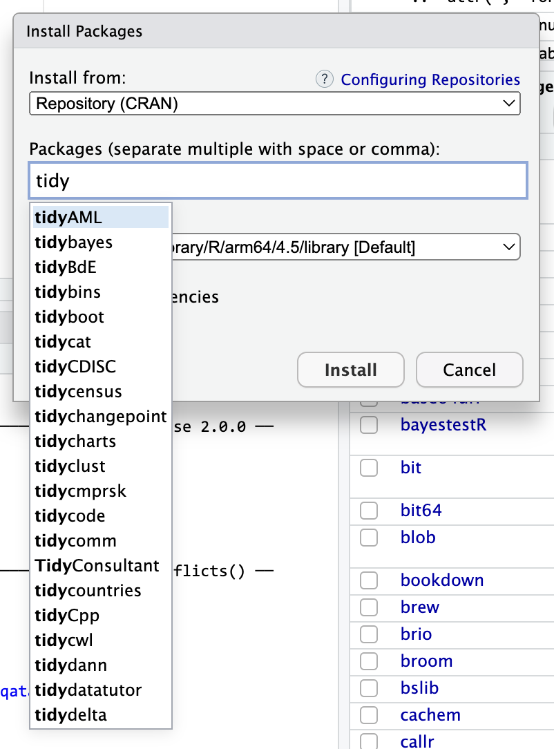
Packages that start with “tidy”
When is it better to use augment() vs. marginaleffects::predictions()?
The two approaches do the same thing, but it’s far easier to use marginaleffects::predictions(). Just use {marginaleffects}.
For example, here’s a regression model that predicts penguin body mass based on flipper length, bill length, bill depth, and sex.
Let’s say we want to see predicted body mass across a range of flipper lengths while holding all other variables constant. Here are three ways:
With augment(), we need to create a small data frame to plug into the model, and then we have to calculate our own confidence intervals:
library(broom)

# Make mini dataset
newdata <- tibble(
  flipper_length_mm = seq(172, 231, by = 1),  # Smallest and biggest flipper lengths
  bill_length_mm = mean(penguins$bill_length_mm),
  bill_depth_mm = mean(penguins$bill_depth_mm),
  sex = "male"  # Use male because there are more males than females
)

# Plug mini dataset into model and calculate confidence intervals
predicted_values <- augment(
  model,
  newdata = newdata,
  se_fit = TRUE
) |>
  mutate(
    conf.low = .fitted + (-1.96 * .se.fit),
    conf.high = .fitted + (1.96 * .se.fit)
  )

# Plot it
ggplot(predicted_values, aes(x = flipper_length_mm, y = .fitted)) +
  geom_ribbon(aes(ymin = conf.low, ymax = conf.high), alpha = 0.5) +
  geom_line()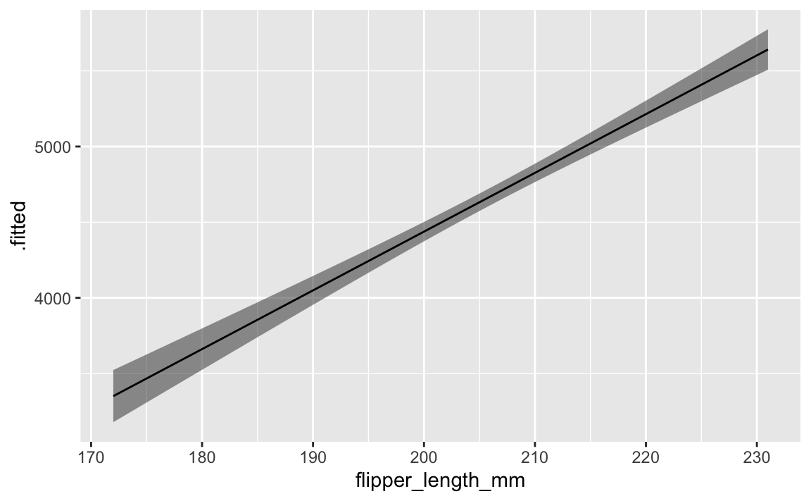
With {marginaleffects}, we don’t need to make our own little newdata data frame, and we don’t need to calculate confidence intervals on our own. It will automatically hold all variables at their means or modes.
library(marginaleffects)

predicted_values_easy <- predictions(
  model,
  newdata = datagrid(flipper_length_mm = seq(172, 231, by = 1))
)

# Plot it
ggplot(predicted_values_easy, aes(x = flipper_length_mm, y = estimate)) +
  geom_ribbon(aes(ymin = conf.low, ymax = conf.high), alpha = 0.5) +
  geom_line()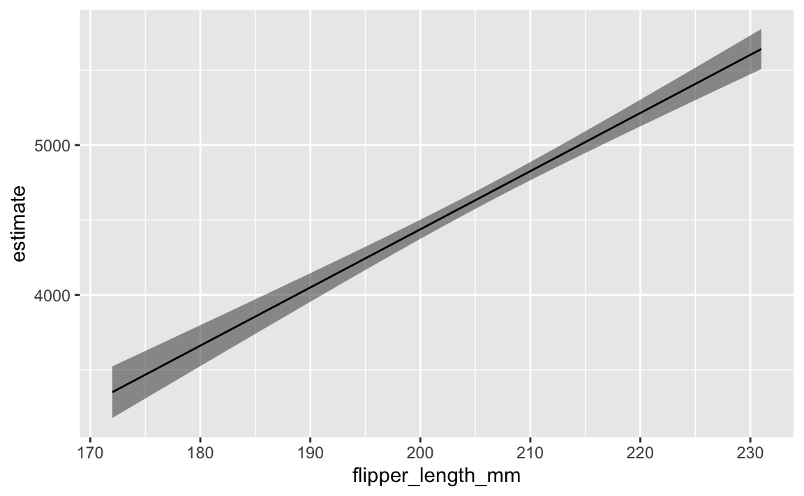
If all you care about is the plot and not the data frame of predictions, you can actually use a shortcut (plot_predictions()) and make a plot automatically:
library(marginaleffects)

plot_predictions(model, condition = "flipper_length_mm")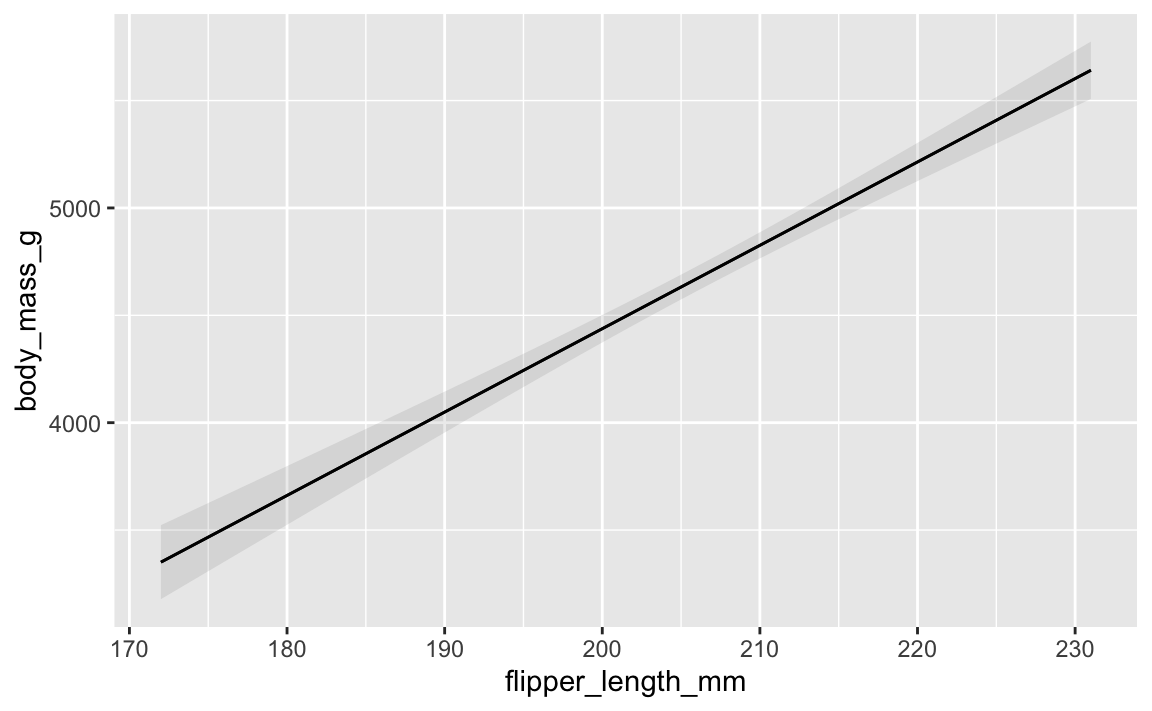
All three approaches do exactly the same thing, but using augment() take a lot more work. Just use {marginaleffects} for everything.
I’ve used summary() in the past to look at model objects, but you recommend using tidy(). Why?
If you’ve worked with R before, you’ve probably used summary() to look at the results of regression models, like this:
summary(model)
##
## Call:
## lm(formula = body_mass_g ~ flipper_length_mm + bill_length_mm +
##     bill_depth_mm + sex, data = penguins)
##
## Residuals:
##     Min      1Q  Median      3Q     Max
## -927.81 -247.66    5.52  220.60  990.45
##
## Coefficients:
##                    Estimate Std. Error t value Pr(>|t|)
## (Intercept)       -2288.465    631.580  -3.623 0.000337 ***
## flipper_length_mm    38.826      2.448  15.862  < 2e-16 ***
## bill_length_mm       -2.329      4.684  -0.497 0.619434
## bill_depth_mm       -86.088     15.570  -5.529 6.58e-08 ***
## sexmale             541.029     51.710  10.463  < 2e-16 ***
## ---
## Signif. codes:  0 '***' 0.001 '**' 0.01 '*' 0.05 '.' 0.1 ' ' 1
##
## Residual standard error: 340.8 on 328 degrees of freedom
## Multiple R-squared:  0.823,  Adjusted R-squared:  0.8208
## F-statistic: 381.3 on 4 and 328 DF,  p-value: < 2.2e-16
That’s great and fine—there’s nothing wrong with that. summary() shows all the coefficients and model diagnostics. However, if you want to extract the coefficient values to plot (like in a coefficient plot), or if you want to compare the R² values for several models, good luck extracting that information programmatically. summary() produces a big wall of (helpful) text.
It’s trickier when using other types of models too. Every model outputs slightly different summary() text. Like, here are the results for a logistic regression model that predicts whether a penguin is a Gentoo or not (i.e. a binary outcome):
penguins_with_binary <- penguins |>
  mutate(is_gentoo = species == "Gentoo")

model_logistic <- glm(
  is_gentoo ~ body_mass_g + flipper_length_mm,
  family = binomial(link = "logit"),
  data = penguins_with_binary
)

summary(model_logistic)
##
## Call:
## glm(formula = is_gentoo ~ body_mass_g + flipper_length_mm, family = binomial(link = "logit"),
##     data = penguins_with_binary)
##
## Coefficients:
##                     Estimate Std. Error z value Pr(>|z|)
## (Intercept)       -1.316e+02  3.094e+01  -4.254 2.10e-05 ***
## body_mass_g        4.312e-03  1.648e-03   2.616  0.00889 **
## flipper_length_mm  5.447e-01  1.384e-01   3.935 8.32e-05 ***
## ---
## Signif. codes:  0 '***' 0.001 '**' 0.01 '*' 0.05 '.' 0.1 ' ' 1
##
## (Dispersion parameter for binomial family taken to be 1)
##
##     Null deviance: 434.15  on 332  degrees of freedom
## Residual deviance:  38.75  on 330  degrees of freedom
## AIC: 44.75
##
## Number of Fisher Scoring iterations: 10
All the results are there, but they’re embedded in the wall of text.
The advantage of {broom} is that it outputs data frames with standard column names for all types of regression models. Each of these models have the same columns for term, estimate, etc.
tidy(model)
## # A tibble: 5 × 5
##   term              estimate std.error statistic  p.value
##   <chr>                <dbl>     <dbl>     <dbl>    <dbl>
## 1 (Intercept)       -2288.      632.      -3.62  3.37e- 4
## 2 flipper_length_mm    38.8       2.45    15.9   1.88e-42
## 3 bill_length_mm       -2.33      4.68    -0.497 6.19e- 1
## 4 bill_depth_mm       -86.1      15.6     -5.53  6.58e- 8
## 5 sexmale             541.       51.7     10.5   2.68e-22
tidy(model_logistic)
## # A tibble: 3 × 5
##   term                estimate std.error statistic   p.value
##   <chr>                  <dbl>     <dbl>     <dbl>     <dbl>
## 1 (Intercept)       -132.       30.9         -4.25 0.0000210
## 2 body_mass_g          0.00431   0.00165      2.62 0.00889
## 3 flipper_length_mm    0.545     0.138        3.93 0.0000832
You can get the model diagnostics (like R², AIC, BIC, etc.) out using glance():
glance(model)
## # A tibble: 1 × 12
##   r.squared adj.r.squared sigma statistic   p.value    df logLik   AIC   BIC
##       <dbl>         <dbl> <dbl>     <dbl>     <dbl> <dbl>  <dbl> <dbl> <dbl>
## 1     0.823         0.821  341.      381. 6.28e-122     4 -2412. 4836. 4859.
## # ℹ 3 more variables: deviance <dbl>, df.residual <int>, nobs <int>
glance(model_logistic)
## # A tibble: 1 × 8
##   null.deviance df.null logLik   AIC   BIC deviance df.residual  nobs
##           <dbl>   <int>  <dbl> <dbl> <dbl>    <dbl>       <int> <int>
## 1          434.     332  -19.4  44.7  56.2     38.7         330   333
And since these {broom} functions return data frames, you can do anything you want with them. With logistic regression, for example, it is common to exponentiate coefficients to create odds ratios. Good luck doing that with the output of summary(). With tidy(), we can do it with mutate():
tidy(model_logistic) |>
  mutate(estmate = exp(estimate))
## # A tibble: 3 × 6
##   term                estimate std.error statistic   p.value  estmate
##   <chr>                  <dbl>     <dbl>     <dbl>     <dbl>    <dbl>
## 1 (Intercept)       -132.       30.9         -4.25 0.0000210 6.88e-58
## 2 body_mass_g          0.00431   0.00165      2.62 0.00889   1.00e+ 0
## 3 flipper_length_mm    0.545     0.138        3.93 0.0000832 1.72e+ 0
I tried to render my document and got an error about duplicate chunk labels. Why?
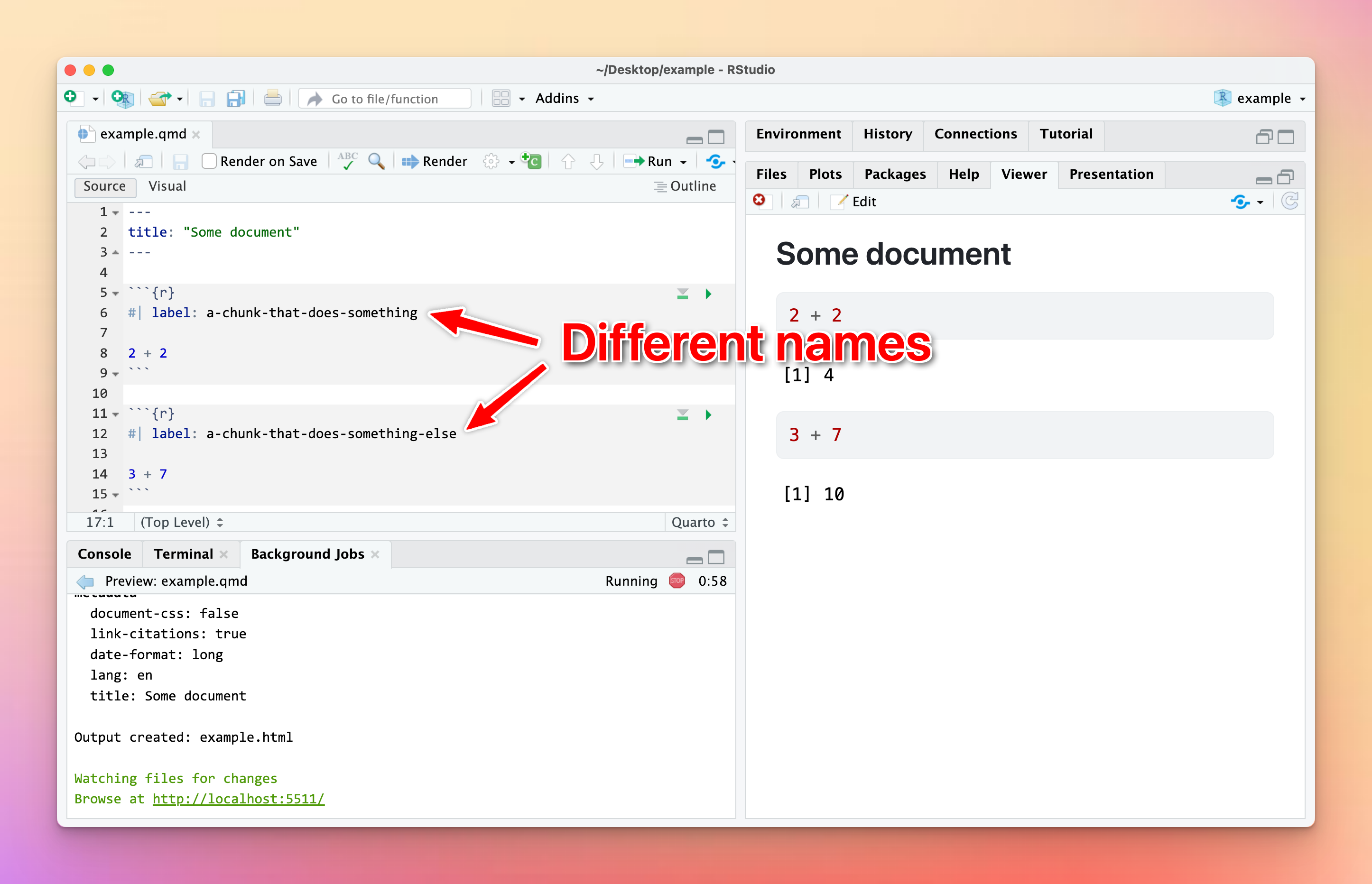
You can (and should!) name your R code chunks—see here for more about how and why. All chunk names must be unique, though.
Often you’ll copy and paste a chunk from earlier in your document to later, like to make a second plot based on the first. That’s fine—just make sure that you change the chunk name.
If there are chunks with repeated names, R will yell at you:

To fix it, change the name of one of the duplicated names to something unique:
I tried calculating something with sum() or cor() and R gave me NA instead of a number. Why?
This nearly always happens because of missing values. Let’s make a quick little dataset to illustrate what’s going on (and how to fix it):
library(tidyverse)

example <- tibble(
  x = c(1, 2, 3, 4, 5),
  y = c(6, 7, NA, 9, 10),
  z = c(2, 6, 5, 7, 3)
)

example
## # A tibble: 5 × 3
##       x     y     z
##   <dbl> <dbl> <dbl>
## 1     1     6     2
## 2     2     7     6
## 3     3    NA     5
## 4     4     9     7
## 5     5    10     3
The y column has a missing value (NA), which will mess up any math we do.
Without running any code, what’s the average of the x column? We can find that with math (add all the numbers up and divide by how many numbers there are):
\[ \frac{1 + 2 + 3 + 4 + 5}{5} = 3 \]
Neat. We can confirm with R:
# With dplyr
example |>
  summarize(avg = mean(x))
## # A tibble: 1 × 1
##     avg
##   <dbl>
## 1     3

# With base R
mean(example$x)
## [1] 3
What’s the average of the y column? Math time:
\[ \frac{6 + 7 + \text{?} + 9 + 10}{5} = \text{Who even knows} \]
We have no way of knowing what the average is because of that missing value.
If we try it with R, it gives us NA instead of a number:
example |>
  summarize(avg = mean(y))
## # A tibble: 1 × 1
##     avg
##   <dbl>
## 1    NA
To fix this, we can tell R to remove all the missing values from the column before calculating the average so that it does this:
\[ \frac{6 + 7 + 9 + 10}{4} = 8 \]
Include the argument na.rm = TRUE to do that:
example |>
  summarize(avg = mean(y, na.rm = TRUE))
## # A tibble: 1 × 1
##     avg
##   <dbl>
## 1     8
This works for lots of R’s calculating functions, like sum(), min(), max(), sd(), median(), mean(), and so on:
example |>
  summarize(
    total = sum(y, na.rm = TRUE),
    avg = mean(y, na.rm = TRUE),
    median = median(y, na.rm = TRUE),
    min = min(y, na.rm = TRUE),
    max = max(y, na.rm = TRUE),
    std_dev = sd(y, na.rm = TRUE)
  )
## # A tibble: 1 × 6
##   total   avg median   min   max std_dev
##   <dbl> <dbl>  <dbl> <dbl> <dbl>   <dbl>
## 1    32     8      8     6    10    1.83
This works a little differently with cor() because you’re working with multiple columns instead of just one. If there are any missing values in any of the columns you’re correlating, you’ll get NA for the columns that use it. Here, we have a correlation between x and z because there are no missing values in either of those, but we get NA for the correlation between x and y and between z and y:
example |>
  cor()
##           x  y         z
## x 1.0000000 NA 0.2287479
## y        NA  1        NA
## z 0.2287479 NA 1.0000000
Adding na.rm to cor() doesn’t work because cor() doesn’t actually have an argument for na.rm:
example |>
  cor(na.rm = TRUE)
## Error in cor(example, na.rm = TRUE): unused argument (na.rm = TRUE)
Instead, if you look at the documentation for cor() (run ?cor in your R console or search for it in the Help panel in RStudio), you’ll see an argument named use instead. By default it will use all the rows in the data (use = "everything"), but we can change it to use = "complete.obs". This will remove all rows where something is missing before calculating the correlation:
example |>
  cor(use = "complete.obs")
##           x         y         z
## x 1.0000000 1.0000000 0.2300895
## y 1.0000000 1.0000000 0.2300895
## z 0.2300895 0.2300895 1.0000000
I want my bars to be sorted in my plot. How can I control their order?
Sorting categories by different values is important for showing trends in your data. By default, R will plot categorical variables in alphabetical order, but often you’ll want these categories to use some sort of numeric order, likely based on a different column.
There are a few different ways to sort categories. First, let’s make a summarized dataset of the total population in each continent in 2007 (using our trusty ol’ gapminder data):
library(gapminder)

# Find the total population in each continent in 2007
population_by_continent <- gapminder |>
  filter(year == 2007) |>
  group_by(continent) |>
  summarize(total_population = sum(pop))
population_by_continent
## # A tibble: 5 × 2
##   continent total_population
##   <fct>                <dbl>
## 1 Africa           929539692
## 2 Americas         898871184
## 3 Asia            3811953827
## 4 Europe           586098529
## 5 Oceania           24549947
By default the continents will be in alphabetic order:
ggplot(
  population_by_continent,
  aes(x = continent, y = total_population, fill = continent)
) +
  geom_col() +
  guides(fill = "none")  # The legend is redundant because of the x-axis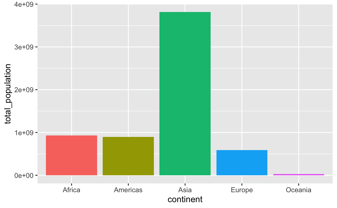
In this case it’s more useful to plot these in order of total population. My favorite approach for this is to (1) sort the data how I want it with arrange() and (2) lock the order of the category in place with fct_inorder(). Note how the mini dataset is now sorted and Oceania comes first:
plot_data_sorted <- population_by_continent |>
  # Sort by population
  arrange(total_population) |>
  # Make continent use the order it's currently in
  mutate(continent = fct_inorder(continent))
plot_data_sorted
## # A tibble: 5 × 2
##   continent total_population
##   <fct>                <dbl>
## 1 Oceania           24549947
## 2 Europe           586098529
## 3 Americas         898871184
## 4 Africa           929539692
## 5 Asia            3811953827
If we plot it, the continents will be in order:
ggplot(
  plot_data_sorted,
  aes(x = continent, y = total_population, fill = continent)
) +
  geom_col() +
  guides(fill = "none")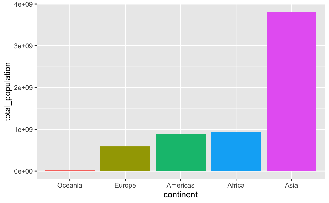
This plots the continents in reverse order, with Oceania on the left. We can reverse this by either arranging the data in descending population order, or by using fct_rev() to reverse the continent order:
plot_data_sorted <- population_by_continent |>
  # Sort by population in descending order
  arrange(desc(total_population)) |>
  # Lock in the continent order
  mutate(continent = fct_inorder(continent))

ggplot(
  plot_data_sorted,
  aes(x = continent, y = total_population, fill = continent)
) +
  geom_col() +
  guides(fill = "none")
plot_data_sorted <- population_by_continent |>
  # Sort by population in ascending order
  arrange(total_population) |>
  # Lock in the continent order
  mutate(continent = fct_inorder(continent))

ggplot(
  plot_data_sorted,
  # Reverse the continent order with fct_rev()
  aes(x = fct_rev(continent), y = total_population, fill = fct_rev(continent))
) +
  geom_col() +
  guides(fill = "none")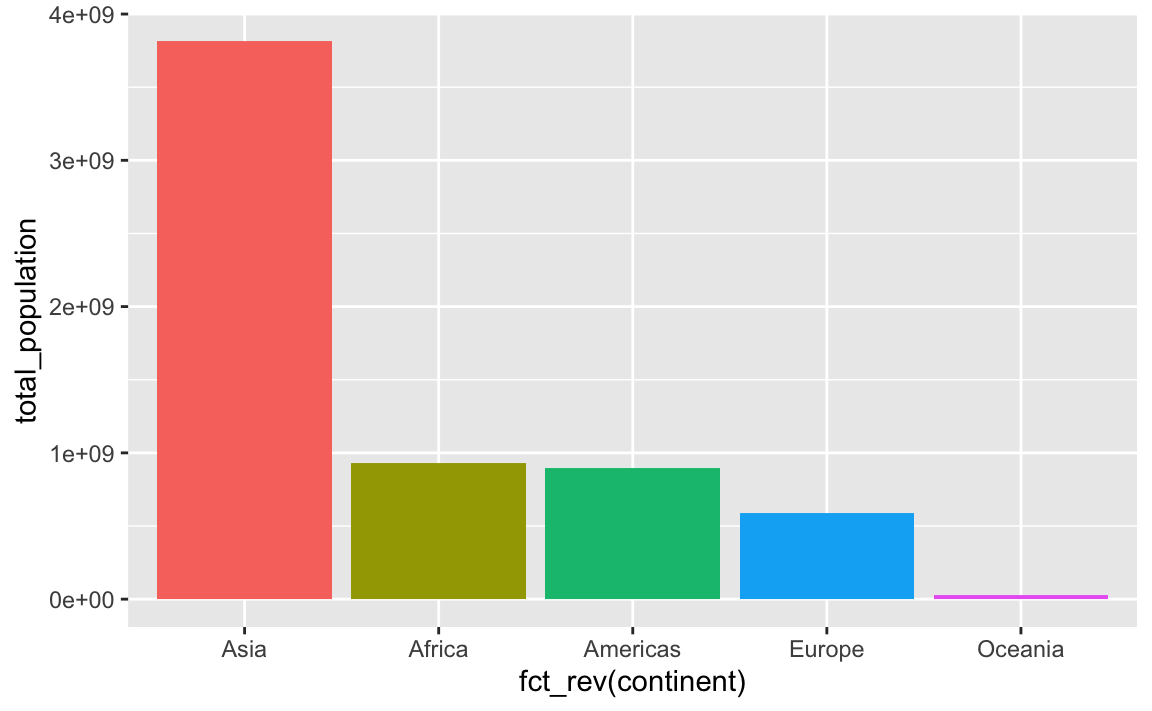
An alternative to the two-step arrange() |> mutate(blah = fct_inorder(blah)) is to use fct_reorder(), which takes two arguments: (1) the column you want to be reordered and (2) the column you want to sort it by:
plot_data_sorted <- population_by_continent |>
  # Sort continent by total_population in descending order
  mutate(continent = fct_reorder(continent, total_population, .desc = TRUE))

ggplot(
  plot_data_sorted,
  aes(x = continent, y = total_population, fill = continent)
) +
  geom_col() +
  guides(fill = "none")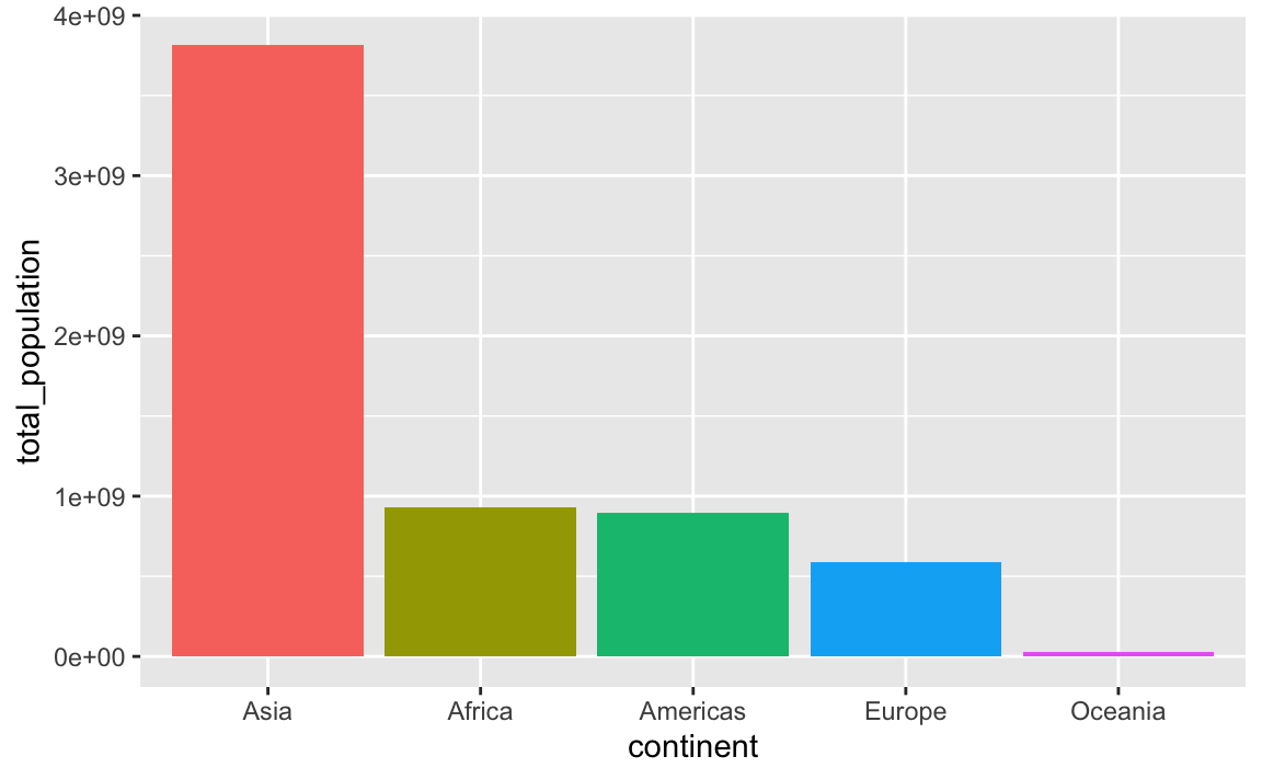
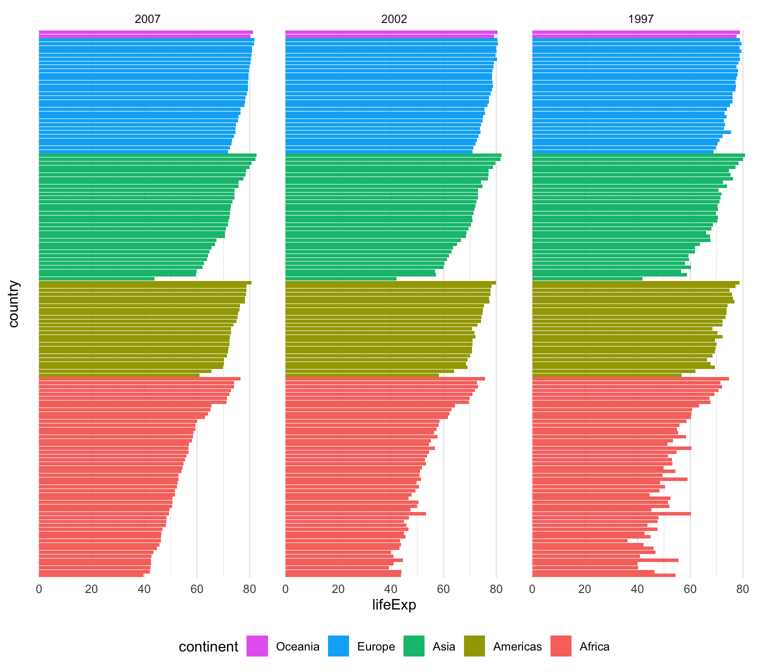
That’s only one line instead of two, which is nice, but I tend to be fan of the two step approach because it’s more explicit and gives me more control over sorting. For instance, here I want all the gapminder countries to be sorted by year (descending), continent, and life expectancy so we can see descending life expectancy within each continent over time.
I’m sure there’s a way to sort by multiple columns in different orders like this with fct_reorder(), but I don’t know how. Plus, if I run this super_sorted_data code up until the end of arrange(), I can look at it in RStudio to make sure all the ordering I want is right. That’s harder to do with fct_reorder().
super_sorted_data <- gapminder |>
  filter(year >= 1997) |>
  # Get the countries in order of year (descending), continent, and life expectancy
  arrange(desc(year), continent, lifeExp) |>
  # Lock the country name order in place + lock the year in place
  mutate(
    country = fct_inorder(country),
    # year is currently a number, so we need to change it to a factor before
    # reordering it
    year = fct_inorder(factor(year))
  )

ggplot(super_sorted_data, aes(y = country, x = lifeExp, fill = continent)) +
  geom_col() +
  facet_wrap(vars(year)) +
  # Reverse the order legend so that Oceania is at the top, since it's at the
  # top in the plot
  guides(fill = guide_legend(reverse = TRUE)) +
  theme_minimal() +
  # Remove country names and y-axis gridlines + put legend on the bottom
  theme(
    axis.text.y = element_blank(),
    axis.ticks.y = element_blank(),
    panel.grid.major.y = element_blank(),
    panel.grid.minor.y = element_blank(),
    legend.position = "bottom"
  )
You can also specify any arbitrary category order with fct_relevel()
plot_data_sorted <- population_by_continent |>
  # Use this specific continent order
  mutate(continent = fct_relevel(
    continent,
    c("Asia", "Oceania", "Europe", "Americas", "Africa"))
  )

ggplot(
  plot_data_sorted,
  aes(x = continent, y = total_population, fill = continent)
) +
  geom_col() +
  guides(fill = "none")
My data has full US state names but I want to use abbreviations (or regions). Is there a way to automatically convert from names to something else?
Yep! R has a few state-related variables built in (run ?state in your R console to see them all):
state.name
##  [1] "Alabama"        "Alaska"         "Arizona"        "Arkansas"
##  [5] "California"     "Colorado"       "Connecticut"    "Delaware"
##  [9] "Florida"        "Georgia"        "Hawaii"         "Idaho"
## [13] "Illinois"       "Indiana"        "Iowa"           "Kansas"
## [17] "Kentucky"       "Louisiana"      "Maine"          "Maryland"
## [21] "Massachusetts"  "Michigan"       "Minnesota"      "Mississippi"
## [25] "Missouri"       "Montana"        "Nebraska"       "Nevada"
## [29] "New Hampshire"  "New Jersey"     "New Mexico"     "New York"
## [33] "North Carolina" "North Dakota"   "Ohio"           "Oklahoma"
## [37] "Oregon"         "Pennsylvania"   "Rhode Island"   "South Carolina"
## [41] "South Dakota"   "Tennessee"      "Texas"          "Utah"
## [45] "Vermont"        "Virginia"       "Washington"     "West Virginia"
## [49] "Wisconsin"      "Wyoming"
state.abb
##  [1] "AL" "AK" "AZ" "AR" "CA" "CO" "CT" "DE" "FL" "GA" "HI" "ID" "IL" "IN" "IA"
## [16] "KS" "KY" "LA" "ME" "MD" "MA" "MI" "MN" "MS" "MO" "MT" "NE" "NV" "NH" "NJ"
## [31] "NM" "NY" "NC" "ND" "OH" "OK" "OR" "PA" "RI" "SC" "SD" "TN" "TX" "UT" "VT"
## [46] "VA" "WA" "WV" "WI" "WY"
state.region
##  [1] South         West          West          South         West
##  [6] West          Northeast     South         South         South
## [11] West          West          North Central North Central North Central
## [16] North Central South         South         Northeast     South
## [21] Northeast     North Central North Central South         North Central
## [26] West          North Central West          Northeast     Northeast
## [31] West          Northeast     South         North Central North Central
## [36] South         West          Northeast     Northeast     South
## [41] North Central South         South         West          Northeast
## [46] South         West          South         North Central West
## Levels: Northeast South North Central West
These aren’t datasets—they’re single vectors—but you can make a little dataset with columns for each of those details, like this:
state_details <- tibble(
  state = state.name,
  state_abb = state.abb,
  state_division = state.division,
  state_region = state.region
) |>
  # Add DC manually
  add_row(
    state = "Washington, DC",
    state_abb = "DC",
    state_division = "South Atlantic",
    state_region = "South"
  )
state_details
## # A tibble: 51 × 4
##    state       state_abb state_division     state_region
##    <chr>       <chr>     <chr>              <chr>
##  1 Alabama     AL        East South Central South
##  2 Alaska      AK        Pacific            West
##  3 Arizona     AZ        Mountain           West
##  4 Arkansas    AR        West South Central South
##  5 California  CA        Pacific            West
##  6 Colorado    CO        Mountain           West
##  7 Connecticut CT        New England        Northeast
##  8 Delaware    DE        South Atlantic     South
##  9 Florida     FL        South Atlantic     South
## 10 Georgia     GA        South Atlantic     South
## # ℹ 41 more rows
You can join this dataset to any data you have that has state names or state abbreviations. Joining the data will bring all the columns from state_details into your data wherever rows match. You’ll learn a lot more about joining things in sesison 12 too.
For instance, imagine you have a dataset that looks like this, similar to the unemployment data from exercise 8:
some_state_data <- tribble(
  ~state, ~something,
  "Wyoming", 5,
  "North Carolina", 9,
  "Nevada", 10,
  "Georgia", 3,
  "Rhode Island", 1,
  "Washington, DC", 6
)
some_state_data
## # A tibble: 6 × 2
##   state          something
##   <chr>              <dbl>
## 1 Wyoming                5
## 2 North Carolina         9
## 3 Nevada                10
## 4 Georgia                3
## 5 Rhode Island           1
## 6 Washington, DC         6
We can merge in (or join) the state_details data so that we add columns for abbreviation, region, and so on, using left_join() (again, see lesson 12 for more about all this):
# Join the state details
data_with_state_details <- some_state_data |>
  left_join(state_details, by = join_by(state))
data_with_state_details
## # A tibble: 6 × 5
##   state          something state_abb state_division state_region
##   <chr>              <dbl> <chr>     <chr>          <chr>
## 1 Wyoming                5 WY        Mountain       West
## 2 North Carolina         9 NC        South Atlantic South
## 3 Nevada                10 NV        Mountain       West
## 4 Georgia                3 GA        South Atlantic South
## 5 Rhode Island           1 RI        New England    Northeast
## 6 Washington, DC         6 DC        South Atlantic South
Now your data_with_state_details data has new columns for abbreviations, divisions, regions, and everything else that was in state_details:
# Use it
ggplot(
  data_with_state_details,
  aes(x = state_abb, y = something, fill = state_region)
) +
  geom_col()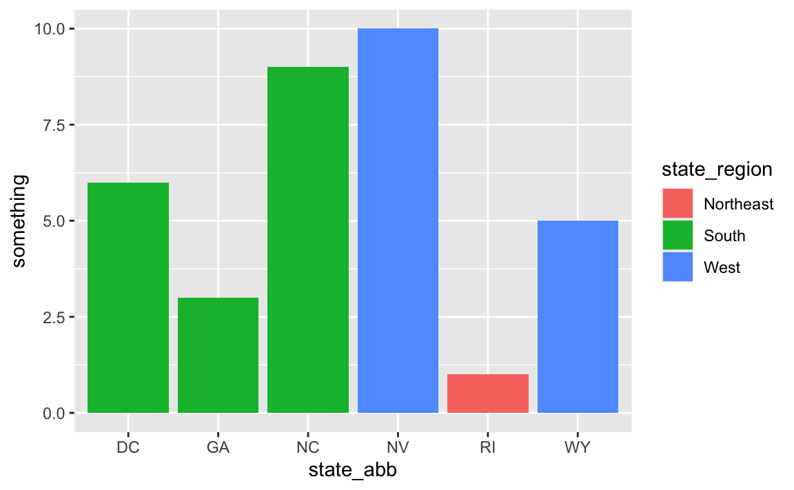
And for fun, we can fix the ordering:
# Fix the ordering
data_with_state_details <- some_state_data |>
  left_join(state_details, by = join_by(state)) |>
  arrange(desc(something)) |>
  mutate(state_abb = fct_inorder(state_abb))

ggplot(
  data_with_state_details,
  aes(x = state_abb, y = something, fill = state_region)
) +
  geom_col()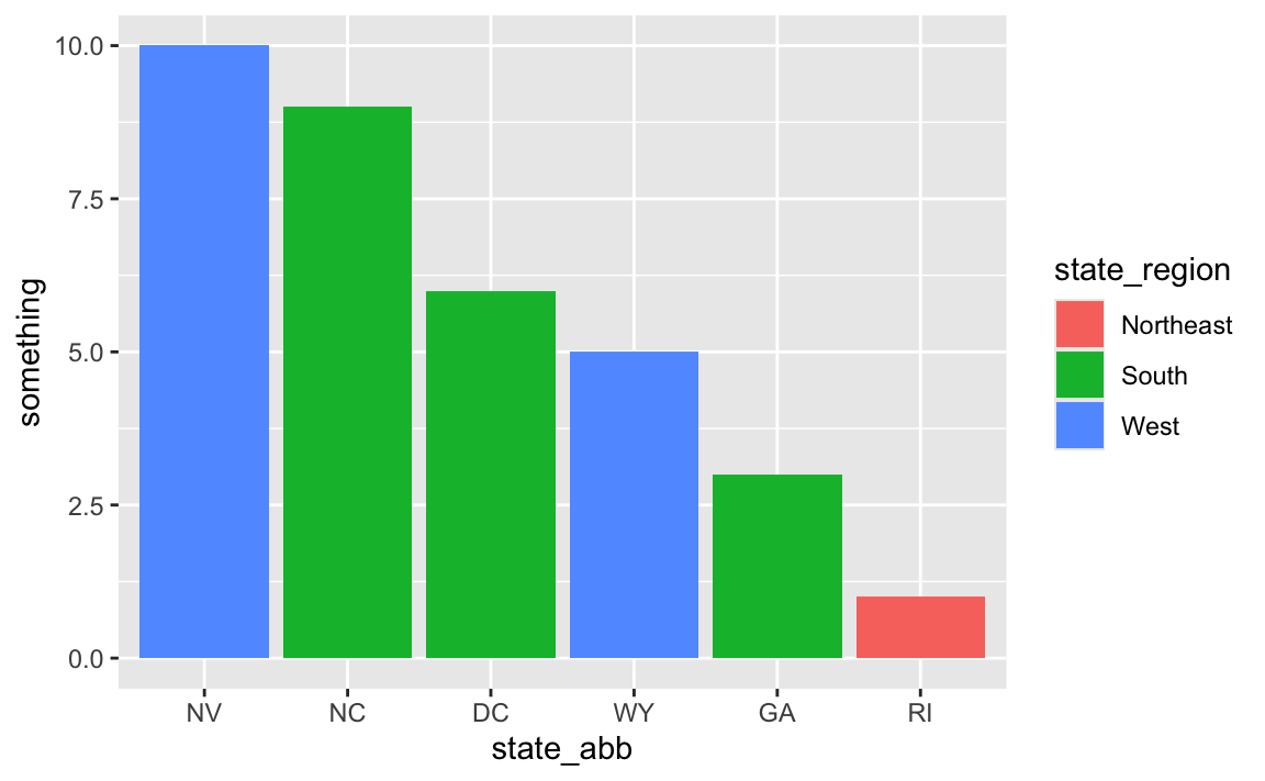
I saved a plot with ggsave() and it has a black background—why?
Let’s make a nice plot with theme_minimal():
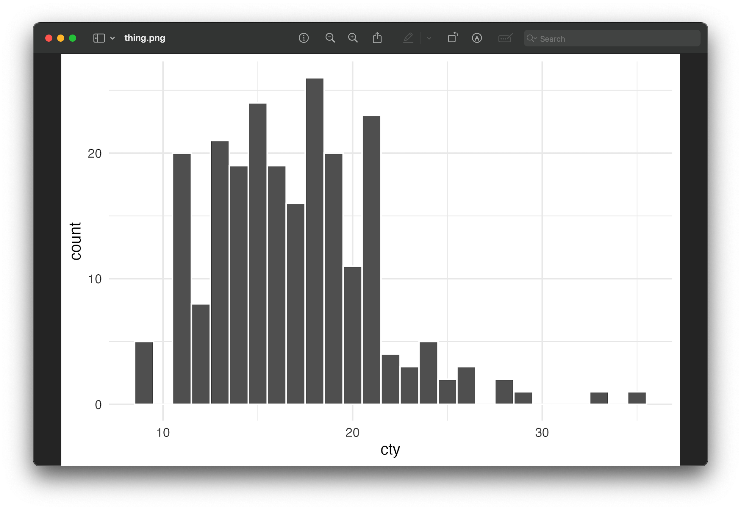
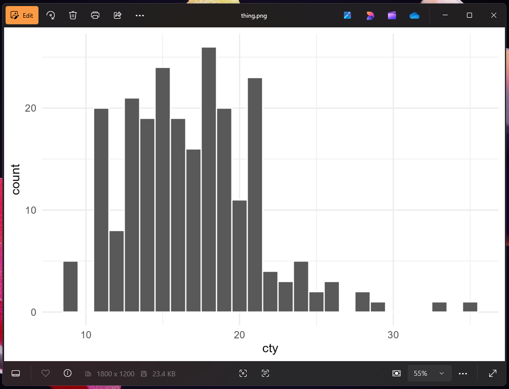
plot_thing <- ggplot(mpg, aes(x = cty)) +
  geom_histogram(binwidth = 1, color = "white") +
  theme_minimal()
plot_thing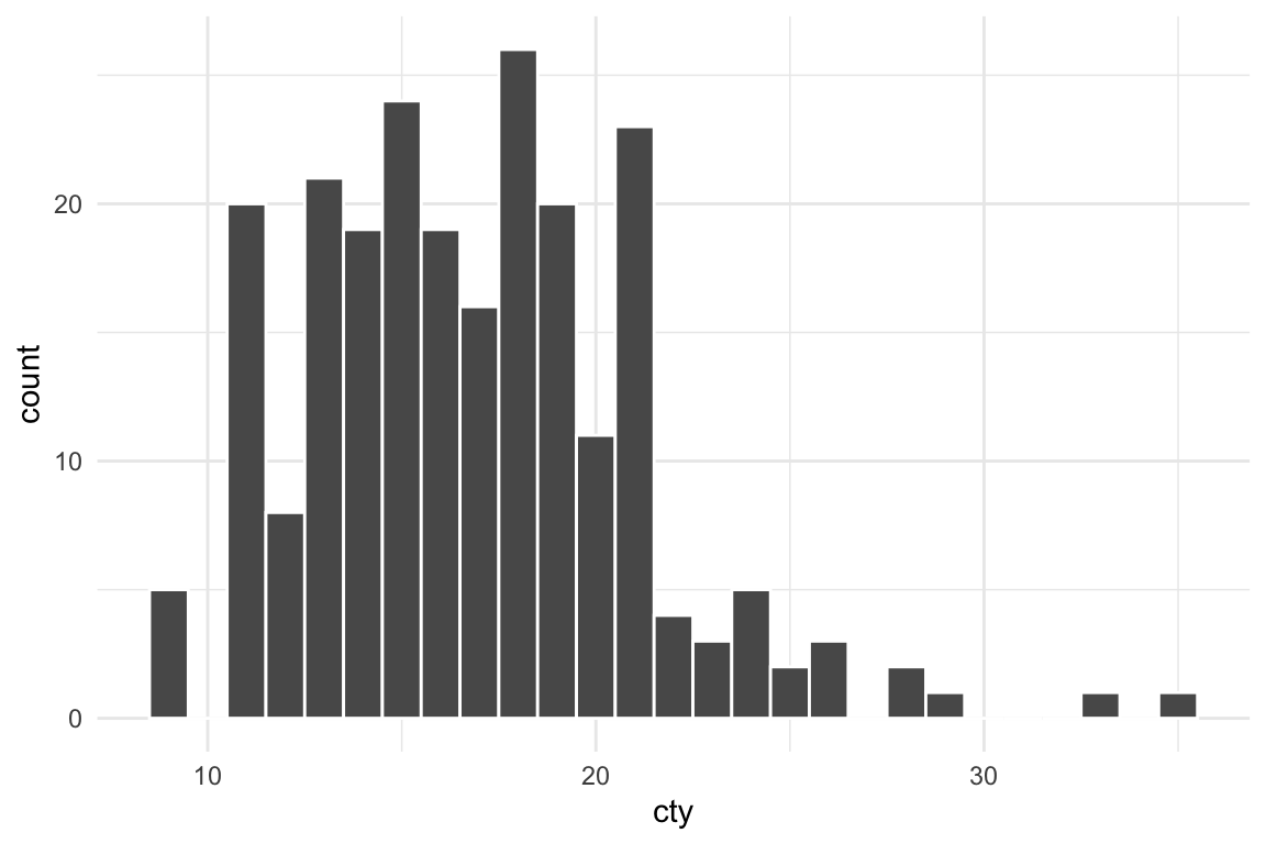
That looks fine, so let’s save it:
ggsave("thing.png", plot_thing, width = 6, height = 4)Now let’s open it in macOS Preview or the Windows Photos app:
![]()
![]()
That doesn’t look like our original image at all! What happened?! Why is it all messed up?
R didn’t add a dark background when saving—it added a transparent background. The reason it looks okay in RStudio and in the rendered document is because those have white overall backgrounds. In both those screenshots above ↑ my macOS and Windows systems are set to dark mode, so Preview and Photos have a dark background, and that’s what’s making the plot appear dark.
If I open this PNG in Illustrator and put it on top of some shapes, you can see the issue more clearly. You can see the text and shapes through the transparent areas of the plot:
To fix this, we need to tell ggsave() to use a white background (or any color you want, though white is typical) with the bg argument:
ggsave("thing.png", plot_thing, width = 6, height = 4, bg = "white")Now if we open the image in Preview or Photos or Illustrator or any other app, it’ll look normal: