ugly_plot <- ggplot(mpg, aes(x = displ, y = hwy, color = drv)) +
geom_point()
ugly_plot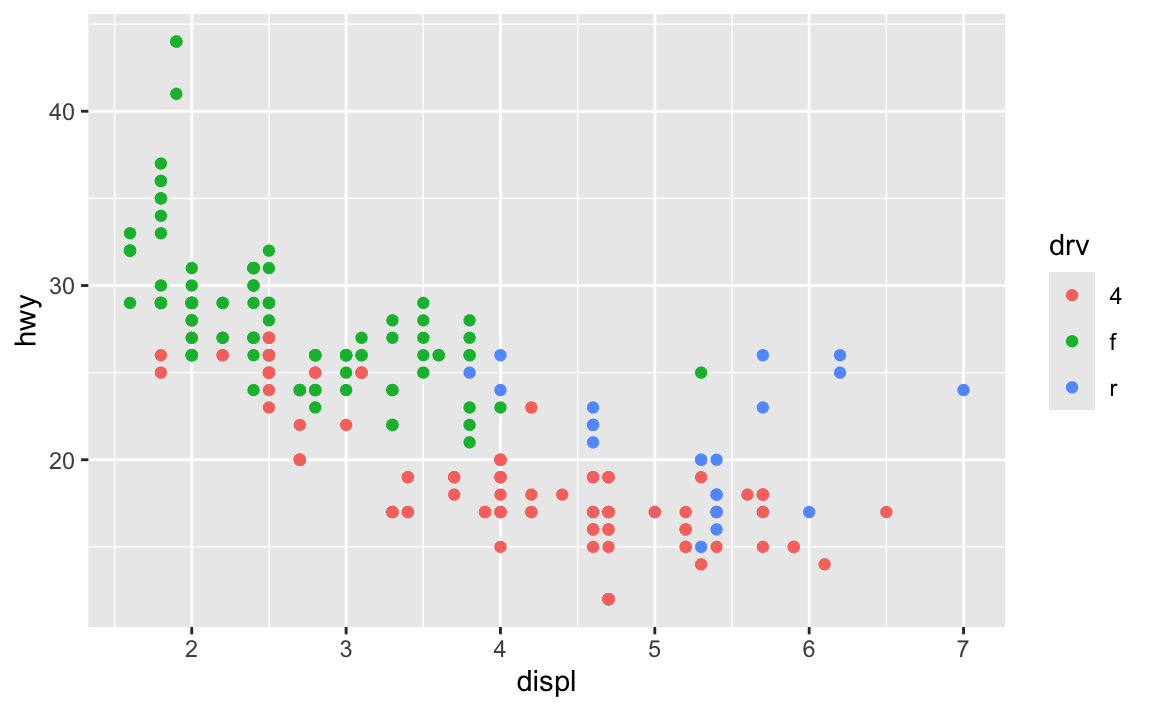
Hi everyone!
I’m really happy with how you all did with exercises 5 and 6 (you made some legitimately hideous plots!).
I got a lot of similar questions and I saw some common issues in the assignments, so like normal, I’ve compiled them all here. Enjoy!
Absolutely! So far, all your Quarto documents have had code included in them, so they’re not really fit for public consumption—you wouldn’t really want to distribute these PDFs as official reports or anything.
But if you set echo: false in the options of your chunks, you can hide the code from the final output so that people only see the figures and tables that you make.
```{r}
#| echo: false

# This will make a plot but not include the code for it in the rendered document
ggplot(mpg, aes(x = displ, y = cty, color = drv)) +
  geom_point()
```
This means that you can make nice clean reports that nobody will know were made with R and Quarto. You can even use fancy Quarto templates and make beautiful output. See these links for examples and details:
ggsave() instead of just rendering a Quarto document?Over the course of the semester, you’ve been rendering PDFs and Word files, and your plots have appeared in those documents, mixed in with the text and code and output. That’s all fine and great.
Sometimes, though, you need a file that is only the plot, not all the other text. You’ll use these standalone images in Session 10, Mini Project 2, and the final project. In real life, you’ll often need to post a PNG version of a graph on a website or on social media. To create a standalone image, you use ggsave().
theme() but when I used ggsave(), none of them actually saved. Why?This is a really common occurrence—don’t worry! And it’s easy to fix!
In the code I gave you in exercise 5, you stored the results of ggplot() as an object named ugly_plot, like this (this isn’t the same data as exercise 5, but shows the same general principle):
ugly_plot <- ggplot(mpg, aes(x = displ, y = hwy, color = drv)) +
  geom_point()

ugly_plot
That ugly_plot object contains the basic underlying plot that you wanted to adjust. You then used it with {ggThemeAssist} to make modifications, something like this:
ugly_plot +
  theme_dark(base_family = "mono") +
  theme(
    legend.position = c(0.5, 0.5),
    legend.title = element_text(family = "Comic Sans MS", size = rel(3)),
    panel.grid = element_line(color = "purple")
  )
## Warning: A numeric `legend.position` argument in `theme()` was deprecated in ggplot2
## 3.5.0.
## ℹ Please use the `legend.position.inside` argument of `theme()` instead.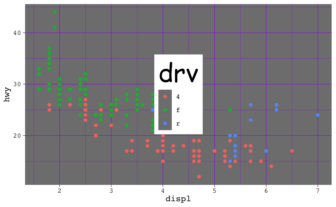
That’s great and nice and ugly and it displays in your document just fine. If you then use ggsave() like this:
ggsave("my_ugly_plot.png", ugly_plot)…you’ll see that it actually doesn’t save all the theme() changes. That’s because it’s saving the ugly_plot object, which is just the underlying base plot before adding theme changes.
If you want to keep the theme changes you make, you need to store them in an object, either overwriting the original ugly_plot object, or creating a new object:
ugly_plot1 <- ugly_plot +
  theme_dark(base_family = "mono") +
  theme(
    legend.position = c(0.5, 0.5),
    legend.title = element_text(family = "Comic Sans MS", size = rel(3)),
    panel.grid = element_line(color = "purple")
  )
# Show the plot
ugly_plot1

# Save the plot
ggsave("my_ugly_plot.png", ugly_plot1)
ugly_plot <- ugly_plot +
theme_dark(base_family = "mono") +
theme(
legend.position = c(0.5, 0.5),
legend.title = element_text(family = "Comic Sans MS", size = rel(3)),
panel.grid = element_line(color = "purple")
)
# Show the plot
ugly_plot
# Save the plot
ggsave("my_ugly_plot.png", ugly_plot)theme() and then wiped them out with theme_minimal()?Yes, the order matters! The order doesn’t matter within theme(), but you can accidentally undo all your theme adjustments if you’re not careful.
For instance, here I make a bunch of changes to the theme, like making the title bold, bigger, and red, and moving the caption to be left-aligned:
ggplot(mpg, aes(x = displ, y = cty, color = drv)) +
  geom_point() +
  labs(title = "Example plot", caption = "Neato caption") +
  theme(
    plot.title = element_text(face = "bold", size = rel(1.8), color = "red"),
    plot.caption = element_text(hjust = 0)
  )
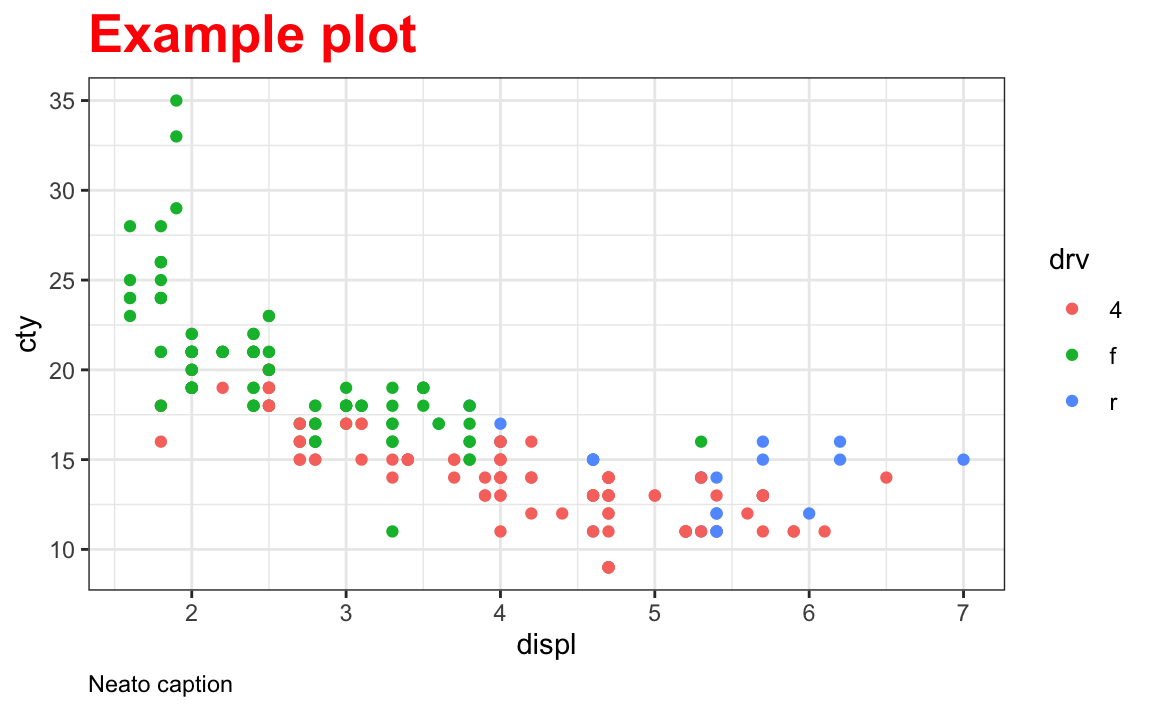
Then later I decide that I want to use one of the built-in themes like theme_bw() to quickly get rid of the gray background:
ggplot(mpg, aes(x = displ, y = cty, color = drv)) +
  geom_point() +
  labs(title = "Example plot", caption = "Neato caption") +
  theme(
    plot.title = element_text(face = "bold", size = rel(1.8), color = "red"),
    plot.caption = element_text(hjust = 0)
  ) +
  theme_bw()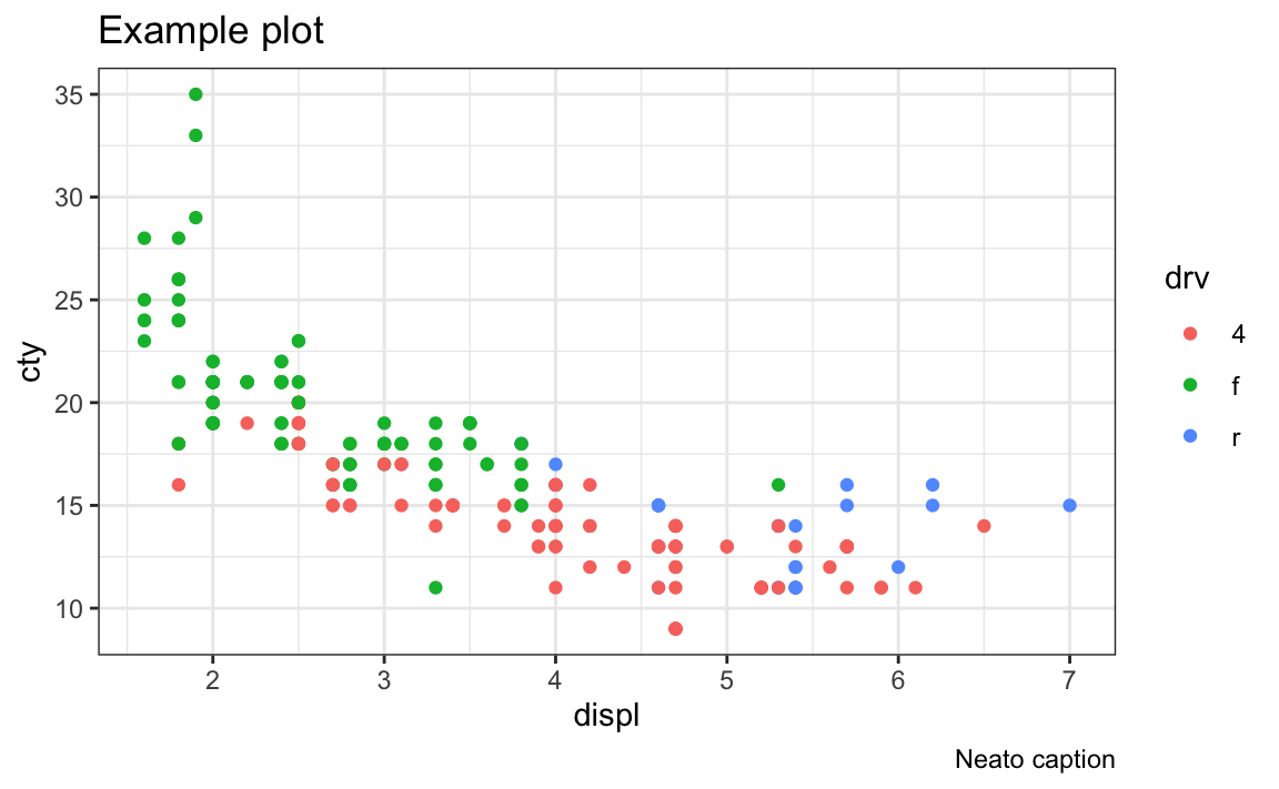
Oh no! The red title and left-aligned caption are gone! What happened?
The built-in themes like theme_gray() (the default), theme_bw(), theme_minimal(), and so on are really collections of a bunch of different theme presets. You can actually see what all the settings are if you run the function without the parentheses. Notice how theme_bw() is really just theme_grey() with some extra settings, like making panel.background white:
theme_bw
## function (base_size = 11, base_family = "", base_line_size = base_size/22,
##     base_rect_size = base_size/22)
## {
##     theme_grey(base_size = base_size, base_family = base_family,
##         base_line_size = base_line_size, base_rect_size = base_rect_size) %+replace%
##         theme(panel.background = element_rect(fill = "white",
##             colour = NA), panel.border = element_rect(fill = NA,
##             colour = "grey20"), panel.grid = element_line(colour = "grey92"),
##             panel.grid.minor = element_line(linewidth = rel(0.5)),
##             strip.background = element_rect(fill = "grey85",
##                 colour = "grey20"), complete = TRUE)
## }
## <bytecode: 0x121fc5ca8>
## <environment: namespace:ggplot2>
If you do this to your plot:
... +
  theme(
    plot.title = element_text(face = "bold", size = rel(1.8), color = "red"),
    plot.caption = element_text(hjust = 0)
  ) +
  theme_bw()
…it will modify the title and caption as expected, but then theme_bw() will overwrite all those changes with its own presets.
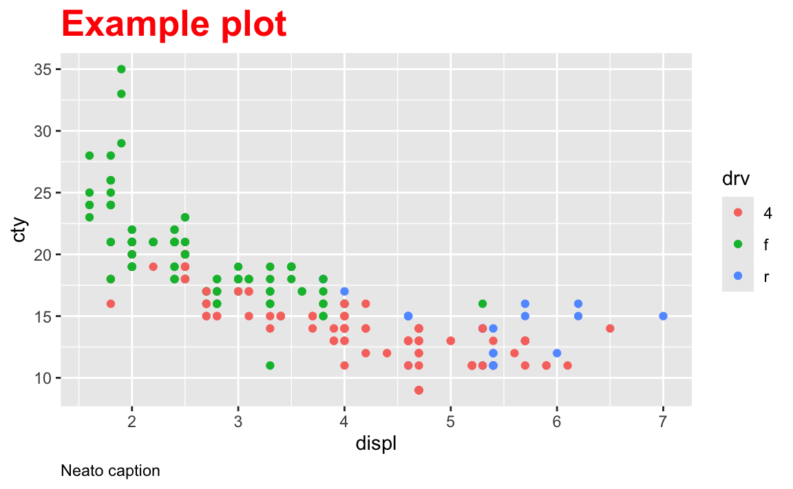
If you want to use a built-in theme like theme_bw() and make other modifications, the order matters. Use the built-in theme first, then make specific changes with theme():
ggplot(mpg, aes(x = displ, y = cty, color = drv)) +
  geom_point() +
  labs(title = "Example plot", caption = "Neato caption") +
  theme_bw() +
  theme(
    plot.title = element_text(face = "bold", size = rel(1.8), color = "red"),
    plot.caption = element_text(hjust = 0)
  )
No!
Recall from the lesson for session 5 that you can store all the theme settings as a separate object. If, for instance, I want to use the combination of theme_bw() with a red title and left-aligned caption like the question above, I can store those settings as an object first:
my_cool_theme <- theme_bw() +
  theme(
    plot.title = element_text(face = "bold", size = rel(1.8), color = "red"),
    plot.caption = element_text(hjust = 0)
  )
And then I can add my_cool_theme to any other plot:
ggplot(mpg, aes(x = displ, fill = drv)) +
  geom_density(alpha = 0.5) +
  labs(title = "A density plot for fun", caption = "Blah blah blah") +
  my_cool_theme
That’s a totally normal and common approach to all this.
theme_set()Another thing you can do is use theme_set(), which will change the default setting for all plots in the session. You can include it up near the top of your document after you load your packages.
See this plot? There’s no extra theme layer at the end because it was set with theme_set():
theme_set(theme_bw())

ggplot(mpg, aes(x = displ, fill = drv)) +
  geom_density(alpha = 0.5) +
  labs(title = "A density plot for fun", caption = "Blah blah blah")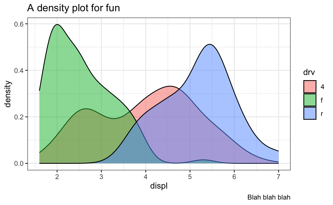
Any plots you make will now use theme_bw() automatically and you don’t have to add it yourself.
You can even pass it a theme object like my_cool_theme:
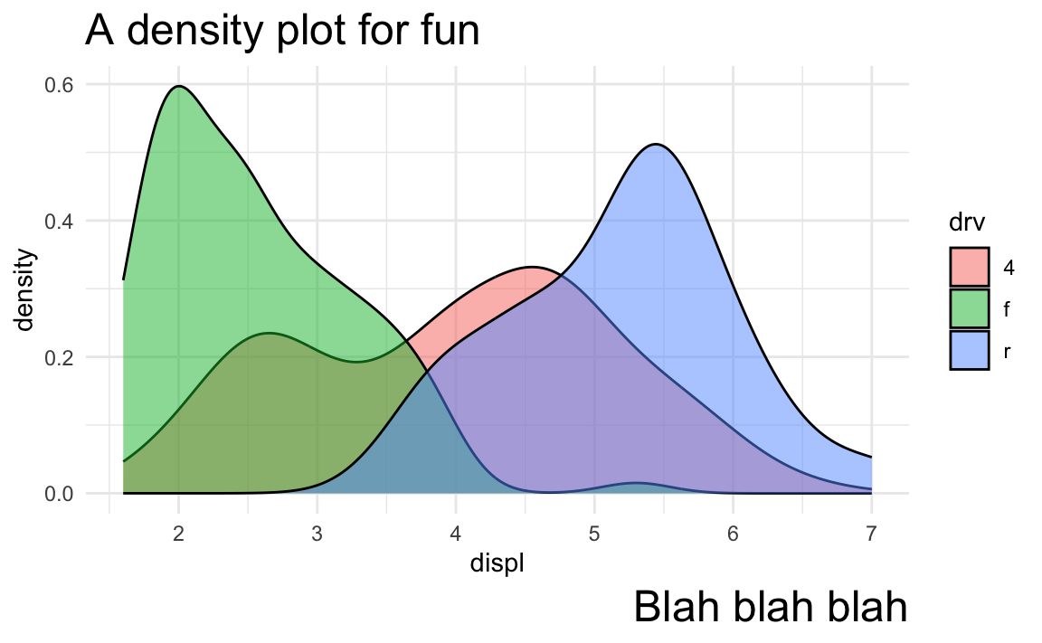
theme_set(my_cool_theme)

ggplot(mpg, aes(x = displ, fill = drv)) +
  geom_density(alpha = 0.5) +
  labs(title = "A density plot for fun", caption = "Blah blah blah")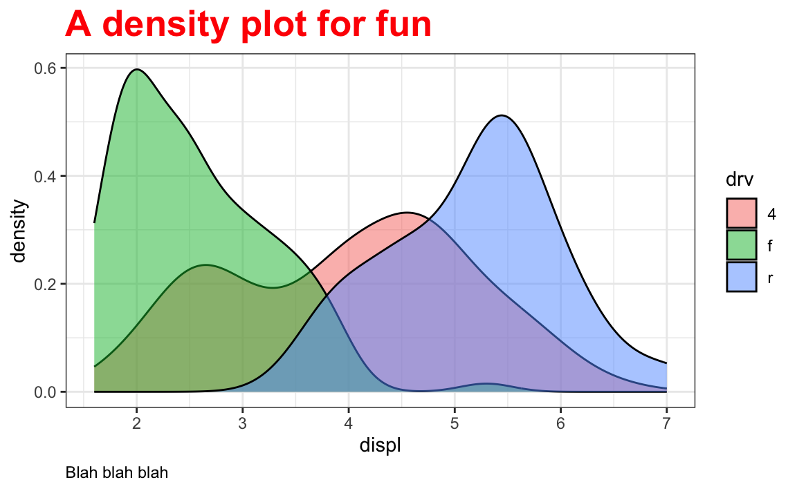
Now any plots you make will use those my_cool_theme settings automatically:
I do this all the time. See this blog post, for example, where I create a nicer theme that I creatively call theme_nice() and then use theme_set() to use it automatically for all the plots:
# Download Mulish from https://fonts.google.com/specimen/Mulish
theme_nice <- function() {
  theme_minimal(base_family = "Mulish") +
    theme(
      panel.grid.minor = element_blank(),
      plot.background = element_rect(fill = "white", color = NA),
      plot.title = element_text(face = "bold"),
      axis.title = element_text(face = "bold"),
      strip.text = element_text(face = "bold"),
      strip.background = element_rect(fill = "grey80", color = NA),
      legend.title = element_text(face = "bold")
    )
}
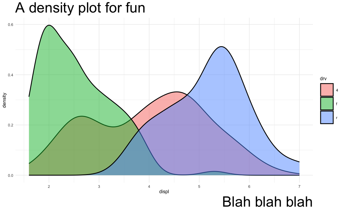
theme_set(theme_nice())rel(1.4) instead of actual numbers when sizing things?A lot of you wondered about this! When changing the size of text elements like plot titles, axis labels, and so on, you use the size argument in element_text(), like this:
ggplot(mpg, aes(x = displ, fill = drv)) +
  geom_density(alpha = 0.5) +
  labs(title = "A density plot for fun", caption = "Blah blah blah") +
  theme_minimal() +
  theme(
    plot.title = element_text(size = 18),
    plot.caption = element_text(size = 18)
  )
Here both the title and caption are sized at 18 points (just like choosing 18 point font in Word or Google Docs). It’s totally valid to set font sizes with actual numbers.
However, I rarely do this. Instead, I use rel(...) to size things so that it’s easier to resize plots more dynamically.
All of the built in theme_*() functions like theme_minimal() and friends have a base_size argument that defaults to 11, meaning that the base font size throughout the plot is 11 points. You can change that to other values, like really big text:
ggplot(mpg, aes(x = displ, fill = drv)) +
  geom_density(alpha = 0.5) +
  labs(title = "A density plot for fun", caption = "Blah blah blah") +
  theme_minimal(base_size = 20)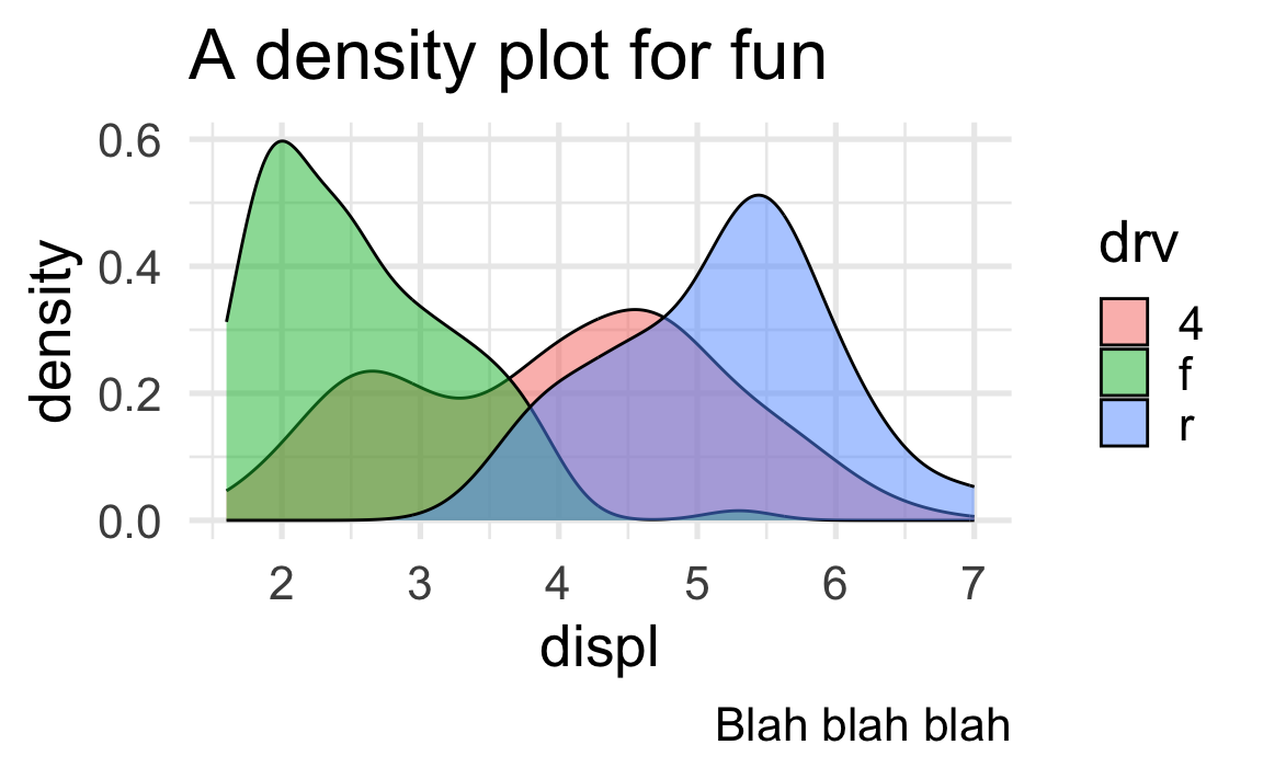
or really small text:
ggplot(mpg, aes(x = displ, fill = drv)) +
  geom_density(alpha = 0.5) +
  labs(title = "A density plot for fun", caption = "Blah blah blah") +
  theme_minimal(base_size = 6)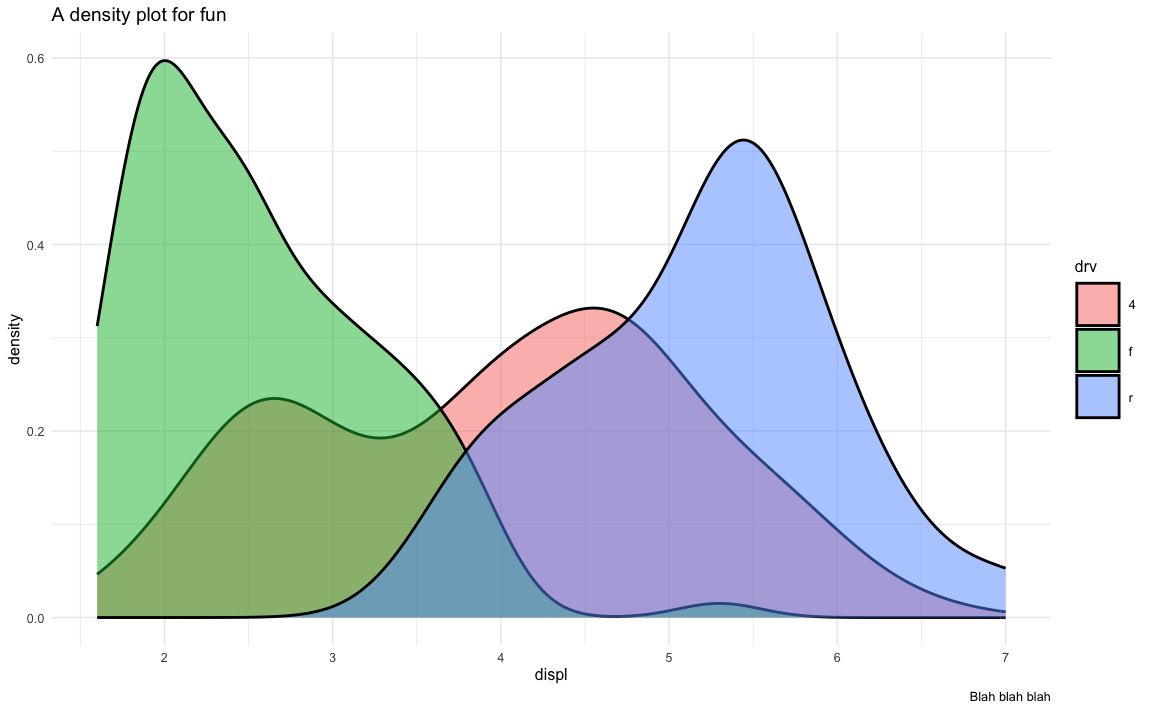
Notice how all the text elements shrink and grow in relation to the base_size. That’s because the text elements use relative sizing instead of absolute sizing. If you run theme_grey by itself in the console, you’ll see all of the exact default theme settings:
theme_grey
#> lots of output
#> ...
#> plot.title = element_text(size = rel(1.2), hjust = 0,
#>      vjust = 1, margin = margin(b = half_line)), plot.title.position = "panel",
#> plot.subtitle = element_text(hjust = 0, vjust = 1, margin = margin(b = half_line)),
#> plot.caption = element_text(size = rel(0.8), hjust = 1,
#>      vjust = 1, margin = margin(t = half_line)), plot.caption.position = "panel",
#> ...
Notice that plot.title is sized to rel(1.2) and plot.caption is sized to rel(0.8). That means that the title font size will be 1.2 * base_size and the caption font size will be 0.8 * base_size. With a base size of 11 points, the title will be 13.2 points and the caption will be 8.8 points. If the base size is scaled up to 20, the title will be 1.2 * 20, or 24 points; if the base size is scaled down to 6, the title will be 1.2 * 6, or 7.2 points.
If you use exact numbers for elements and then change base_size, the elements with absolute values will not scale up or down. Like here, if we want tiny text (base_size = 6), the title and caption will still be massive at 18 points:
ggplot(mpg, aes(x = displ, fill = drv)) +
  geom_density(alpha = 0.5) +
  labs(title = "A density plot for fun", caption = "Blah blah blah") +
  theme_minimal(base_size = 6) +
  theme(
    plot.title = element_text(size = 18),
    plot.caption = element_text(size = 18)
  )
So instead of working with absolute numbers, I almost always use relative values. If you search my code on GitHub, you’ll see a ton of examples where I’ve done this.
This is a weird little quirk about fonts on a Mac. See here for full details.
The short version of how to fix it is to tell R and Quarto to use the Cairo PDF rendering program when creating a PDF. Cairo supports custom fonts, while R’s default PDF rendering program does not.
Add this to the metadata section of your Quarto file to get it working:
title: "Whatever"
author: "Whoever"
format:
  pdf:
    knitr:
      opts_chunk:
        dev: "cairo_pdf"
If you’re trying to save a PDF with ggsave(), you can specify the Cairo engine with the device argument:
ggsave(..., filename = "whatever.pdf", ..., device = cairo_pdf)Absolutely! We don’t have time in this class to cover tables, but there’s a whole world of packages for making beautiful tables with R. Four of the more common ones are {tinytable}, {gt}, {kableExtra}, and {flextable}:
| Package |
Output support
|
Notes | |||
|---|---|---|---|---|---|
| HTML | Word | ||||
| {tinytable} | Great | Great | Okay | Examples | Simple, straightforward, and lightweight. It has fantastic support for HTML (though not as fancy as {gt}, and it has the absolute best support for PDF. |
| {gt} | Great | Okay | Okay | Examples | Has the goal of becoming the “grammar of tables” (hence “gt”). It is supported by developers at Posit and gets updated and improved regularly. It’ll likely become the main table-making package for R. |
| {kableExtra} | Great | Great | Okay | Examples | Works really well for HTML output and has great support for PDF output, but development has stalled for the past couple years and it seems to maybe be abandoned, which is sad. |
| {flextable} | Great | Okay | Great | Examples | Works really well for HTML output and has the best support for Word output. It’s not abandoned and gets regular updates. |
Here’s a quick illustration of these four packages. All four are incredibly powerful and let you do all sorts of really neat formatting things ({gt} even makes interactive HTML tables!), so make sure you check out the documentation and examples. I personally use {tinytable} and {gt} for all my tables, depending on which output I’m working with. When rendering to HTML, I use {tinytable} or {gt}; when rendering to PDF I use {tinytabe}; when rendering to Word I use {flextable}.
library(tidyverse)

cars_summary <- mpg |>
  group_by(year, drv) |>
  summarize(
    n = n(),
    avg_mpg = mean(hwy),
    median_mpg = median(hwy),
    min_mpg = min(hwy),
    max_mpg = max(hwy)
  ) |>
ungroup()library(tinytable)
cars_summary |>
select(
Drive = drv, N = n, Average = avg_mpg, Median = median_mpg,
Minimum = min_mpg, Maximum = max_mpg
) |>
tt() |>
group_tt(
i = list("1999" = 1, "2008" = 4),
j = list("Highway MPG" = 3:6)
) |>
format_tt(j = 3, digits = 4) |>
style_tt(i = c(1, 5), bold = TRUE, line = "b", line_width = 0.1, line_color = "#dddddd") |>
style_tt(j = 2:6, align = "c")| Highway MPG | |||||
|---|---|---|---|---|---|
| Drive | N | Average | Median | Minimum | Maximum |
| 4 | 49 | 18.84 | 17 | 15 | 26 |
| f | 57 | 27.91 | 26 | 21 | 44 |
| r | 11 | 20.64 | 21 | 16 | 26 |
| 4 | 54 | 19.48 | 19 | 12 | 28 |
| f | 49 | 28.45 | 29 | 17 | 37 |
| r | 14 | 21.29 | 21 | 15 | 26 |
library(gt)

cars_summary |>
  gt() |>
  cols_label(
    drv = "Drive",
    n = "N",
    avg_mpg = "Average",
    median_mpg = "Median",
    min_mpg = "Minimum",
    max_mpg = "Maximum"
  ) |>
  tab_spanner(
    label = "Highway MPG",
    columns = c(avg_mpg, median_mpg, min_mpg, max_mpg)
  ) |>
  fmt_number(
    columns = avg_mpg,
    decimals = 2
  ) |>
  tab_options(
    row_group.as_column = TRUE
)| year | Drive | N |
Highway MPG
|
|||
|---|---|---|---|---|---|---|
| Average | Median | Minimum | Maximum | |||
| 1999 | 4 | 49 | 18.84 | 17 | 15 | 26 |
| 1999 | f | 57 | 27.91 | 26 | 21 | 44 |
| 1999 | r | 11 | 20.64 | 21 | 16 | 26 |
| 2008 | 4 | 54 | 19.48 | 19 | 12 | 28 |
| 2008 | f | 49 | 28.45 | 29 | 17 | 37 |
| 2008 | r | 14 | 21.29 | 21 | 15 | 26 |
library(kableExtra)

cars_summary |>
  ungroup() |>
  select(-year) |>
  kbl(
    col.names = c("Drive", "N", "Average", "Median", "Minimum", "Maximum"),
    digits = 2
  ) |>
  kable_styling() |>
  pack_rows("1999", 1, 3) |>
  pack_rows("2008", 4, 6) |>
add_header_above(c(" " = 2, "Highway MPG" = 4))| Drive | N | Average | Median | Minimum | Maximum |
|---|---|---|---|---|---|
| 1999 | |||||
| 4 | 49 | 18.84 | 17 | 15 | 26 |
| f | 57 | 27.91 | 26 | 21 | 44 |
| r | 11 | 20.64 | 21 | 16 | 26 |
| 2008 | |||||
| 4 | 54 | 19.48 | 19 | 12 | 28 |
| f | 49 | 28.45 | 29 | 17 | 37 |
| r | 14 | 21.29 | 21 | 15 | 26 |
library(flextable)

cars_summary |>
  rename(
    "Year" = year,
    "Drive" = drv,
    "N" = n,
    "Average" = avg_mpg,
    "Median" = median_mpg,
    "Minimum" = min_mpg,
    "Maximum" = max_mpg
    ) |>
  mutate(Year = as.character(Year)) |>
  flextable() |>
  colformat_double(j = "Average", digits = 2) |>
  add_header_row(values = c(" ", "Highway MPG"), colwidths = c(3, 4)) |>
  align(i = 1, part = "header", align = "center") |>
  merge_v(j = ~ Year) |>
  valign(j = 1, valign = "top")
| Highway MPG | |||||
|---|---|---|---|---|---|---|
Year | Drive | N | Average | Median | Minimum | Maximum |
1999 | 4 | 49 | 18.84 | 17 | 15 | 26 |
f | 57 | 27.91 | 26 | 21 | 44 | |
r | 11 | 20.64 | 21 | 16 | 26 | |
2008 | 4 | 54 | 19.48 | 19 | 12 | 28 |
f | 49 | 28.45 | 29 | 17 | 37 | |
r | 14 | 21.29 | 21 | 15 | 26 | |
You can also create more specialized tables for specific situations, like side-by-side regression results tables with {modelsummary} (which uses {gt}, {kableExtra}, or {flextable} behind the scenes)
library(modelsummary)

model1 <- lm(hwy ~ displ, data = mpg)
model2 <- lm(hwy ~ displ + drv, data = mpg)

modelsummary(
  list(model1, model2),
  stars = TRUE,
  # Rename the coefficients
  coef_rename = c(
    "(Intercept)" = "Intercept",
    "displ" = "Displacement",
    "drvf" = "Drive (front)",
    "drvr" = "Drive (rear)"),
  # Get rid of some of the extra goodness-of-fit statistics
  gof_omit = "IC|RMSE|F|Log",
  # Use {tinytable}
  output = "tinytable"
)| (1) | (2) | |
|---|---|---|
| + p < 0.1, * p < 0.05, ** p < 0.01, *** p < 0.001 | ||
| Intercept | 35.698*** | 30.825*** |
| (0.720) | (0.924) | |
| Displacement | -3.531*** | -2.914*** |
| (0.195) | (0.218) | |
| Drive (front) | 4.791*** | |
| (0.530) | ||
| Drive (rear) | 5.258*** | |
| (0.734) | ||
| Num.Obs. | 234 | 234 |
| R2 | 0.587 | 0.736 |
| R2 Adj. | 0.585 | 0.732 |
As you’ve read, double encoding aesthetics can be helpful for accessibility and printing reasons—for instance, if points have colors and shapes, they’re still readable by people who are colorblind or if the image is printed in black and white:
ggplot(mpg, aes(x = displ, y = hwy, color = drv, shape = drv)) +
  geom_point()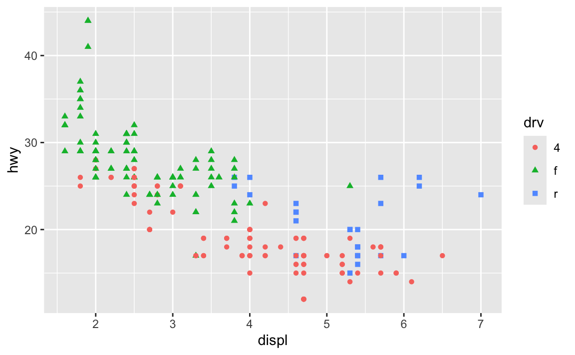
Sometimes the double encoding can be excessive though, and you can safely remove legends. For example, in exercises 3 and 4, you made bar charts showing counts of different things (words spoken in The Lord of the Rings; pandemic-era construction projects in New York City), and lots of you colored the bars, which is great!
car_counts <- mpg |>
  group_by(drv) |>
  summarize(n = n())

ggplot(car_counts, aes(x = drv, y = n, fill = drv)) +
  geom_col()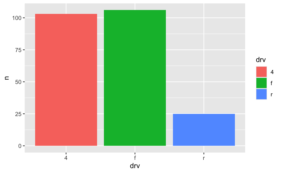
Car drive here is double encoded: it’s on the x-axis and it’s the fill. That’s great, but having the legend here is actually a little excessive. Both the x-axis and the legend tell us what the different colors of drives are (four-, front-, and rear-wheeled drives), so we can safely remove the legend and get a little more space in the plot area:
ggplot(car_counts, aes(x = drv, y = n, fill = drv)) +
  geom_col() +
  guides(fill = "none")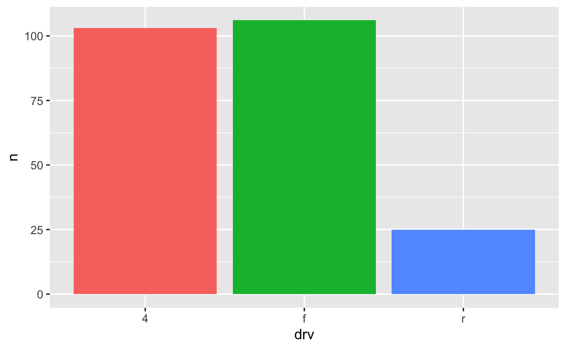
Yes! Later in the semester we’ll cover annotations, but in the meantime, you can check out a couple packages that let you directly label geoms that have been mapped to aesthetics.
The {geomtextpath} package lets you add labels directly to paths and lines with functions like geom_textline() and geom_labelline() and geom_labelsmooth().
Like, here’s the relationship between penguin bill lengths and penguin weights across three different species:
# This isn't on CRAN, so you need to install it by running this:
# remotes::install_github("AllanCameron/geomtextpath")
library(geomtextpath)
library(palmerpenguins)  # Penguin data

# Get rid of the rows that are missing sex
penguins <- penguins |> drop_na(sex)

ggplot(
  penguins,
  aes(x = bill_length_mm, y = body_mass_g, color = species)
) +
  geom_point(alpha = 0.5) +  # Make the points a little bit transparent
  geom_labelsmooth(
    aes(label = species),
    # This spreads the letters out a bit
    text_smoothing = 80
  ) +
  # Turn off the legend bc we don't need it now
  guides(color = "none")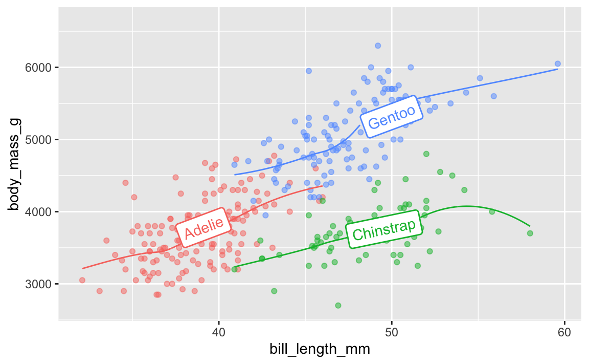
And the average continent-level life expectancy across time:
library(gapminder)

gapminder_lifeexp <- gapminder |>
  group_by(continent, year) |>
  summarize(avg_lifeexp = mean(lifeExp))

ggplot(
  gapminder_lifeexp,
  aes(x = year, y = avg_lifeexp, color = continent)
) +
  geom_textline(
    aes(label = continent, hjust = continent),
    linewidth = 1, size = 4
  ) +
  guides(color = "none")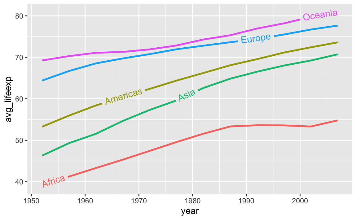
A new package named {ggdirectlabel} lets you add legends directly to your plot area:
# This also isn't on CRAN, so you need to install it by running this:
# remotes::install_github("MattCowgill/ggdirectlabel")
library(ggdirectlabel)

ggplot(
  penguins,
  aes(x = bill_length_mm, y = body_mass_g, color = species)
) +
  geom_point(alpha = 0.5) +
  geom_smooth() +
  geom_richlegend(
    aes(label = species),  # Use the species as the fake legend labels
    legend.position = "topleft",  # Put it in the top left
    hjust = 0  # Make the text left-aligned (horizontal adjustment, or hjust)
  ) +
  guides(color = "none")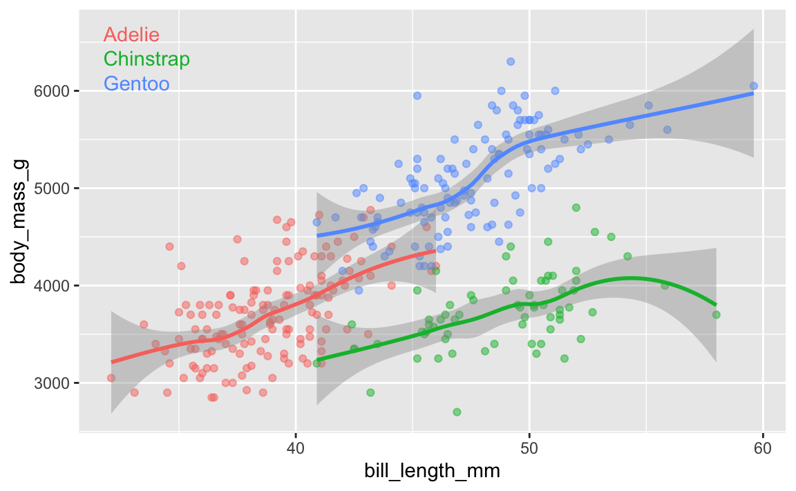
In exercise 6, a lot of you ran into issues with the GDP per capita histogram. The main issue was related to bin widths.
Histograms work by taking a variable, cutting it up into smaller buckets, and counting how many rows appear in each bucket. For example, here’s a histogram of life expectancy from gapminder, with the binwidth argument set to 5:
library(tidyverse)
library(gapminder)

gapminder_2007 <- gapminder |>
  filter(year == 2007)

ggplot(gapminder_2007, aes(x = lifeExp)) +
  geom_histogram(binwidth = 5, color = "white", boundary = 0)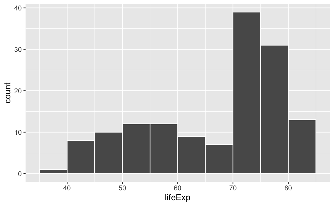
The binwidth = 5 setting means that each of those bars shows the count of countries with life expectancies in five-year buckets: 35–40, 40–45, 45–50, and so on.
If we change that to binwidth = 1, we get narrower bars because we have smaller buckets—each bar here shows the count of countries with life expectancies between 50–51, 51–52, 52–53, and so on.
ggplot(gapminder_2007, aes(x = lifeExp)) +
  geom_histogram(binwidth = 1, color = "white", boundary = 0)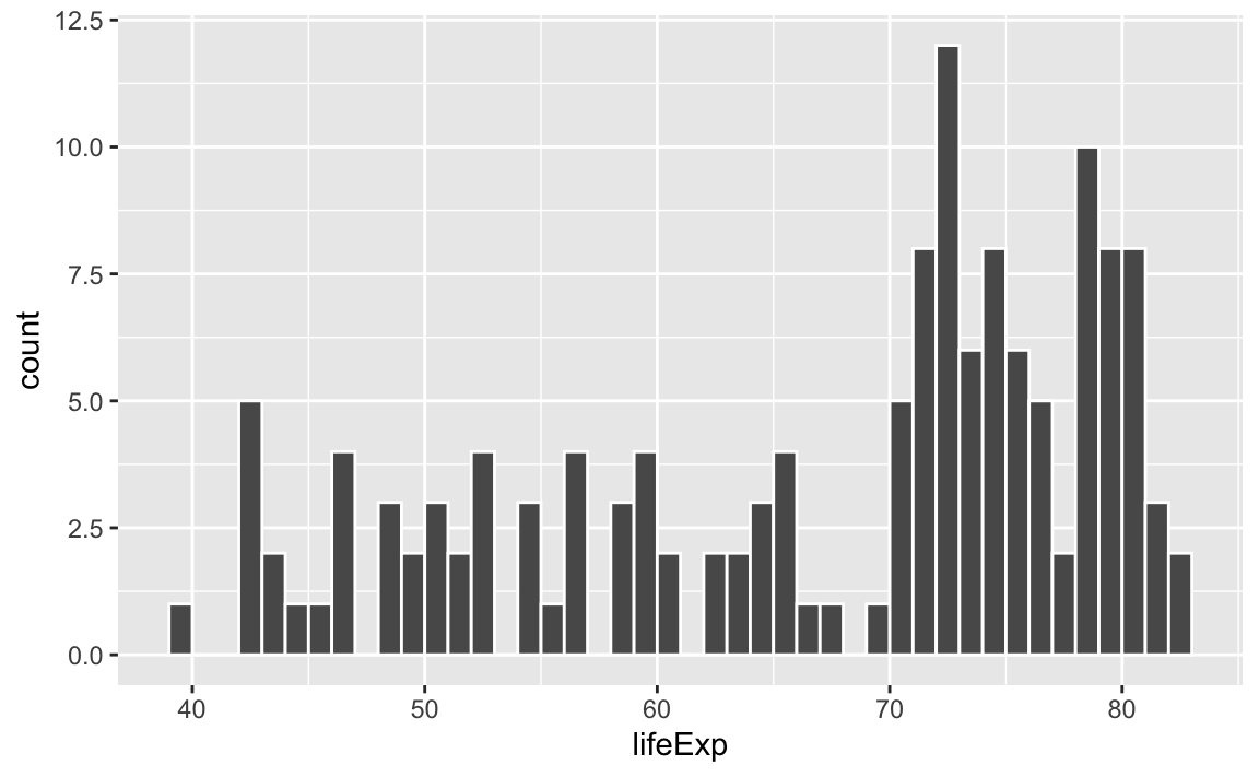
If we change it to binwidth = 20, we get huge bars because the buckets are huge. Now each bar shows the count of countries with life expectancies between 20–40, 40–60, 60–80, and 80–100:
ggplot(gapminder_2007, aes(x = lifeExp)) +
  geom_histogram(binwidth = 20, color = "white", boundary = 0)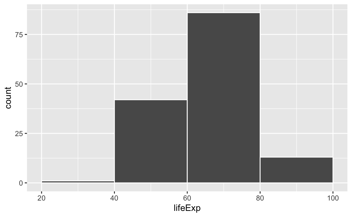
There is no one correct good universal value for the bin width and it depends entirely on your data.
Lots of you ran into an issue when copying/pasting code from the example, where one of the example histograms used binwidth = 1, since that was appropriate for that variable.
Watch what happens if you plot a histogram of GDP per capita using binwidth = 1:
ggplot(gapminder_2007, aes(x = gdpPercap)) +
  geom_histogram(binwidth = 1, color = "white", boundary = 0)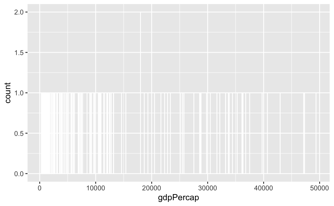
haha yeah that’s delightfully wrong. Each bar here is showing the count of countries with GDP per capita is $10,000–$10,001, then $10,001–$10.002, then $10,002–$10,003, and so on. Basically every country has its own unique GDP per capita, so the count for each of those super narrow bars is 1 (there’s one exception where two countries fall in the same bucket, which is why the y-axis goes up to 2). You can’t actually see any of the bars here because they’re too narrow—all you can really see is the white border around the bars.
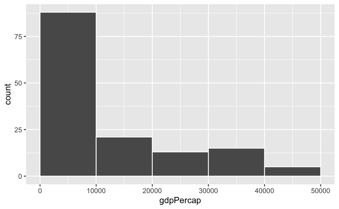
To actually see what’s happening, you need a bigger bin width. How much bigger is up to you. With life expectancy we played around with 1, 5, and 20, but those bucket sizes are waaaay too small for GDP per capita. Try bigger values instead. But again, there’s no right number here!
ggplot(gapminder_2007, aes(x = gdpPercap)) +
  geom_histogram(binwidth = 1000, color = "white", boundary = 0)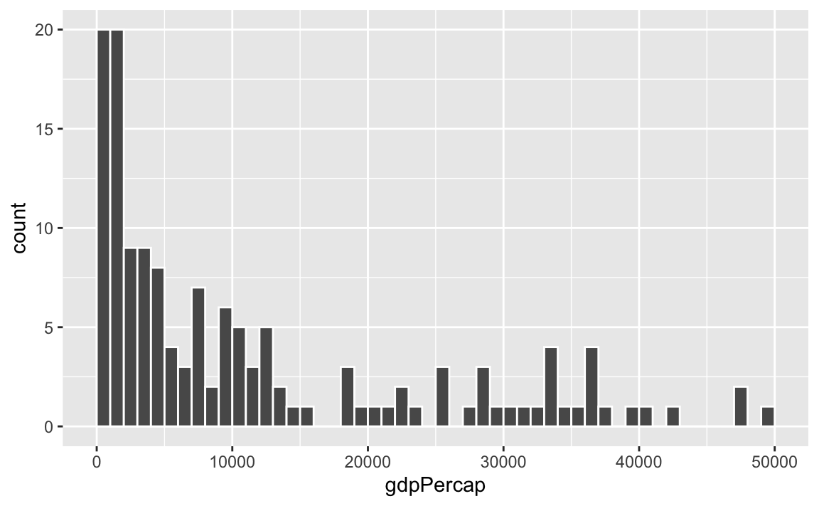
ggplot(gapminder_2007, aes(x = gdpPercap)) +
  geom_histogram(binwidth = 2000, color = "white", boundary = 0)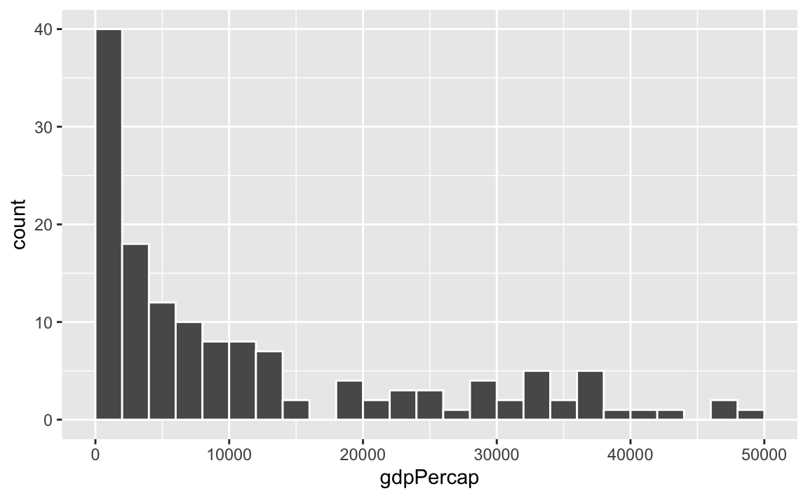
ggplot(gapminder_2007, aes(x = gdpPercap)) +
  geom_histogram(binwidth = 5000, color = "white", boundary = 0)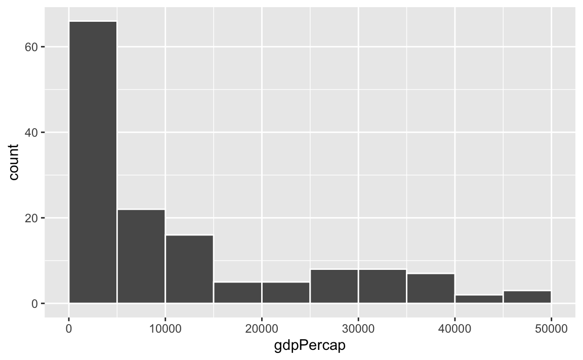
ggplot(gapminder_2007, aes(x = gdpPercap)) +
  geom_histogram(binwidth = 10000, color = "white", boundary = 0)