# There are some rows with missing data, so we'll drop those
penguins <- palmerpenguins::penguins |> drop_na(sex)

ggplot(penguins, aes(x = species, y = island)) +
  geom_point()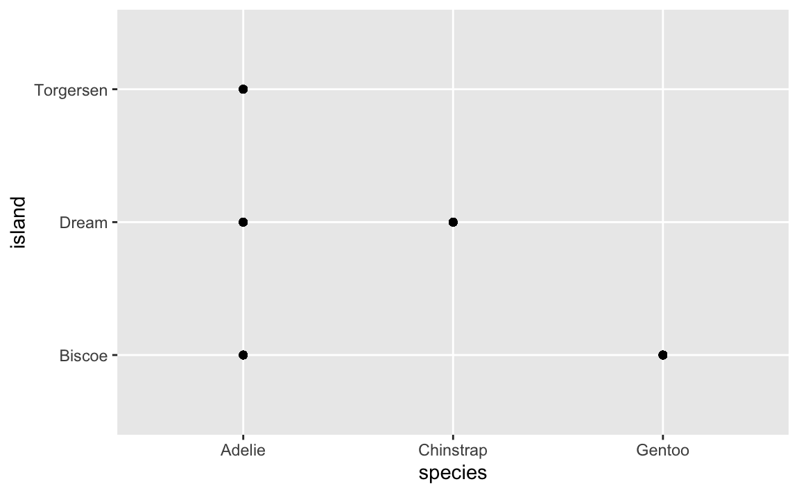
Hi everyone!
Great work with session 4 too! Here are a bunch of (hopefully helpful!) FAQs from that exercise.
That’s great! It’s impossible to memorize all this stuff. You shouldn’t! That’s why documentation exists.
It is not cheating to look at the help pages for functions in R. It is not cheating to turn to google. You should do this!
Remember this from the “Copy, paste, and tweak” announcement a while ago:
Inevitably in the classes where I teach R, I have students say things like “I’m trying to do this without looking at any documentation!” or “I can’t do this without googling—I’m a failure!”. While the effort to be fully independent and perfect with code is noble, it’s totally unnecessary. Everyone looks stuff up all the time—being able to do something without looking stuff up shouldn’t be your end goal.
Eventually you’ll be able to whip out basic
ggplot(..., aes(...)) + geom_point() + geom_smooth() + labs()kinds of things without copying and pasting—that comes naturally over time, and you see me do that in the videos. But as soon as I have to start changing axis breaks or do anything beyond the standard stuff, I immediately start googling and looking at the documentation. Everyone does it. The authors of these packages do it. That’s why documentation exists. So don’t feel bad if you do it too. It’s the dirty little secret of all programming everywhere—it’s impossible to write code without referring to documentation or other people’s code (or your past code).
Do not be super noble and force yourself to write everything from scratch! Do look things up!
Relatedly, a few of you have noted (with a little frustration) that you wanted to do something like change colors or add labels and those things weren’t covered (yet) in the content or lesson, so you had to look it up yourself on the internet. That’s normal and how this works! It is impossible to teach everything related to R and ggplot. The way you learn this stuff is by saying “This plot is neat, but I want to change the colors a bit and move the caption to the left side” and then figuring out how to do that, either by (1) remembering what you’ve learned, or (2) searching for how to do it (a) in the documentation, (b) in the primers or the course website (you can search these sites with the magnifying glass icon in the top navigation bar), (c) in your own past work, or (d) or on Google or somewhere else.
Yeah! This does feel a little weird and wrong. Like, if you have a scatterplot, you don’t really want to mess up the data a little do you?
Sometimes you actually do though.
There are a couple situations where jittering is fine and normal and acceptable and okay.
First, here’s a plot of three different species of penguins across three different Antarctic islands:
# There are some rows with missing data, so we'll drop those
penguins <- palmerpenguins::penguins |> drop_na(sex)
ggplot(penguins, aes(x = species, y = island)) +
geom_point()
This plot is helpful—it shows that Torgersen Island only has Adelie penguins, Dream Island has Adelies and Chinstraps, and Biscoe Island has Adelies and Gentoos.
HOWEVER, there are actually 300+ points here, but you can’t actually see them. They’re all stacked on top of each other. We can jitter the points a little to see them all:
ggplot(penguins, aes(x = species, y = island)) +
  geom_point(position = position_jitter())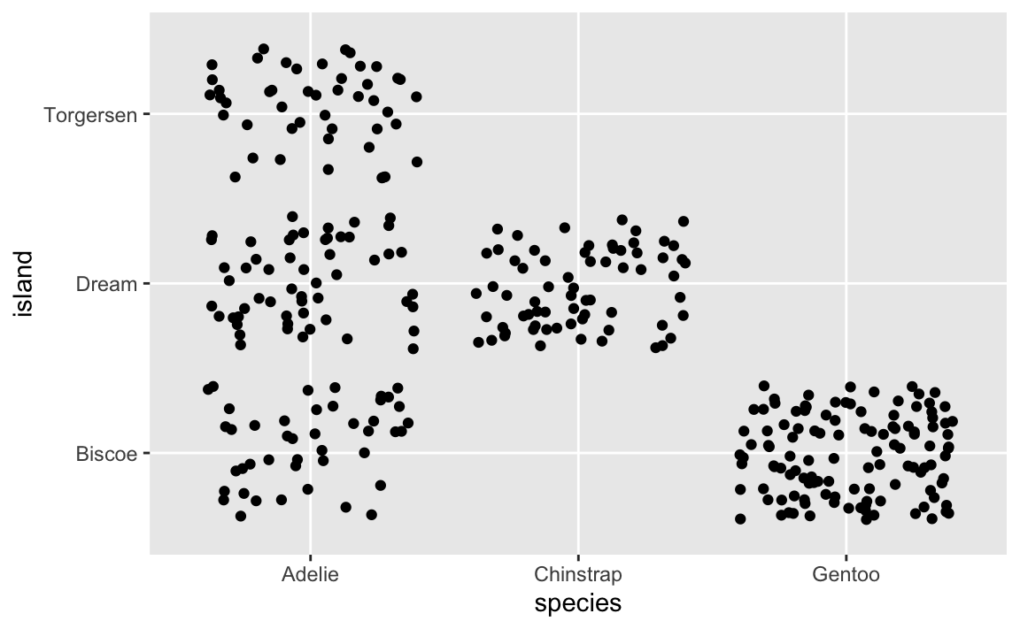
This is more helpful because now we can see how many of each type of penguin there are. For example, Biscoe Island has both Adelies and Gentoos, but there are a lot more Gentoos.
You can control how much spread the jittering gets with the width and height arguments to position_jitter():
ggplot(penguins, aes(x = species, y = island)) +
  # Randomly spread out across 25% of the width and 10% of the height of each category
  geom_point(position = position_jitter(width = 0.25, height = 0.1))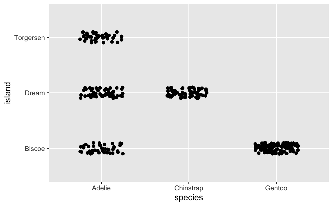
Jittering in this case is totaly fine and good because moving a point from the very middle of the Adelie axis mark on the x-axis to a little bit left of the axis mark doesn’t distort the fact that it’s still an Adelie.
Controlling the direction of jittering is helpful when one of the axes has numeric values. Like this plot showing body mass across species:
ggplot(penguins, aes(x = species, y = body_mass_g)) +
  geom_point()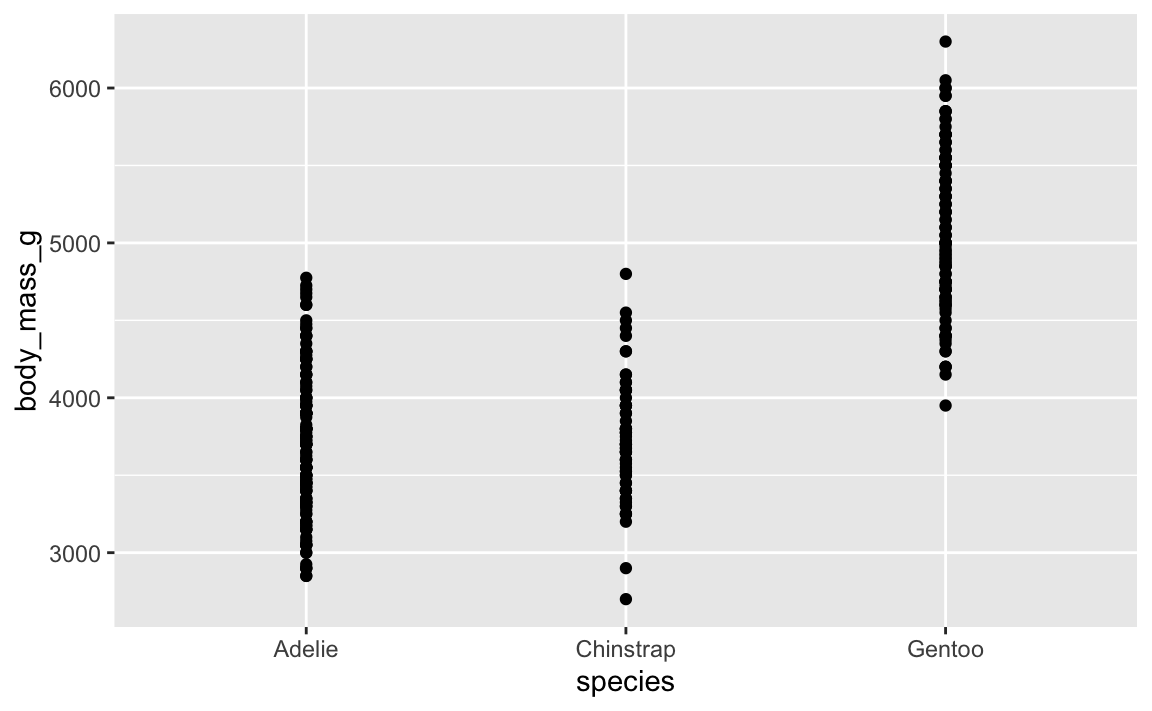
That’s not very helpful since there are so many points still stacked on each other. We can jitter this horizontally, but not vertically. If we jitter vertically, we’ll randomly add/substract body mass from each penguin, which we don’t want to do:
ggplot(penguins, aes(x = species, y = body_mass_g)) +
  # height = 0 makes it so points don't jitter up and down
  geom_point(position = position_jitter(width = 0.25, height = 0))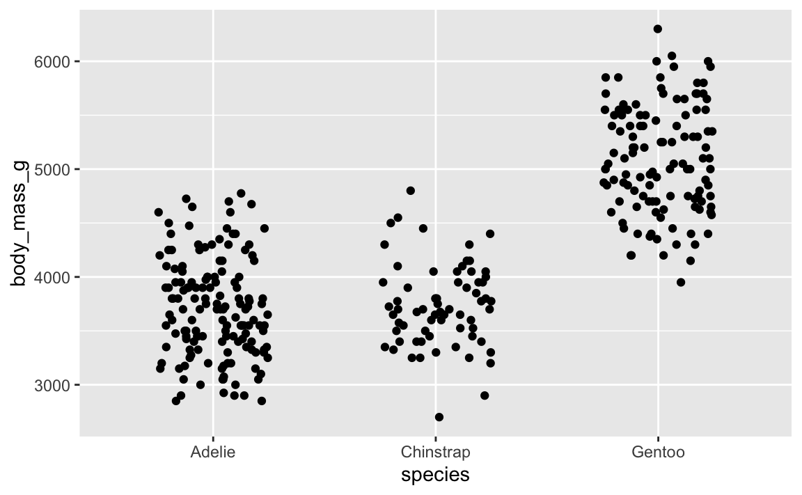
In the last question of exercise 4, your heatmap had two empty areas because there were no approved homeless shelter projects in Brooklyn or Staten Island. However, instead of showing up as 0 in the plot, they were blank, since they were missing entirely.
Here’s a little example with the penguin data. We already know from the example above that not all penguin species live on all the islands.
First, we’ll count how many penguins are on each island and in each species:
penguin_heatmap_data <- penguins |>
  group_by(island, species) |>
  summarize(total = n())
penguin_heatmap_data
## # A tibble: 5 × 3
## # Groups:   island [3]
##   island    species   total
##   <fct>     <fct>     <int>
## 1 Biscoe    Adelie       44
## 2 Biscoe    Gentoo      119
## 3 Dream     Adelie       55
## 4 Dream     Chinstrap    68
## 5 Torgersen Adelie       47
Even though there are 9 possible combinations of species and islands (3 species × 3 islands = 9), there are only 5 rows in the data here, since there are no Gentoos on Torgersen or Dream Islands, and so on.
Next we’ll plot this as a heatmap:
ggplot(penguin_heatmap_data, aes(x = island, y = species, fill = total)) +
  geom_tile() +
  scale_fill_gradient(low = "pink", high = "darkred") +
  coord_equal()  # This makes the tiles be squares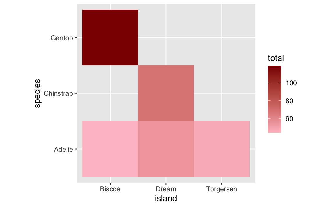
The five rows of species/island counts appear as expected, but there are gaps. Instead of showing these as tiles with 0 penguins, they’re just not there.
One easy way to fix this is to tell group_by() to not get rid of empty combinations of island and species. We can do this by adding .drop = FALSE:
penguin_heatmap_data_better <- penguins |>
  group_by(island, species, .drop = FALSE) |>
  summarize(total = n())
penguin_heatmap_data_better
## # A tibble: 9 × 3
## # Groups:   island [3]
##   island    species   total
##   <fct>     <fct>     <int>
## 1 Biscoe    Adelie       44
## 2 Biscoe    Chinstrap     0
## 3 Biscoe    Gentoo      119
## 4 Dream     Adelie       55
## 5 Dream     Chinstrap    68
## 6 Dream     Gentoo        0
## 7 Torgersen Adelie       47
## 8 Torgersen Chinstrap     0
## 9 Torgersen Gentoo        0
Now there are rows for the combinations with no penguins, and the count is 0, as expected. This will plot better now:
ggplot(penguin_heatmap_data_better, aes(x = island, y = species, fill = total)) +
  geom_tile() +
  scale_fill_gradient(low = "pink", high = "darkred") +
coord_equal() 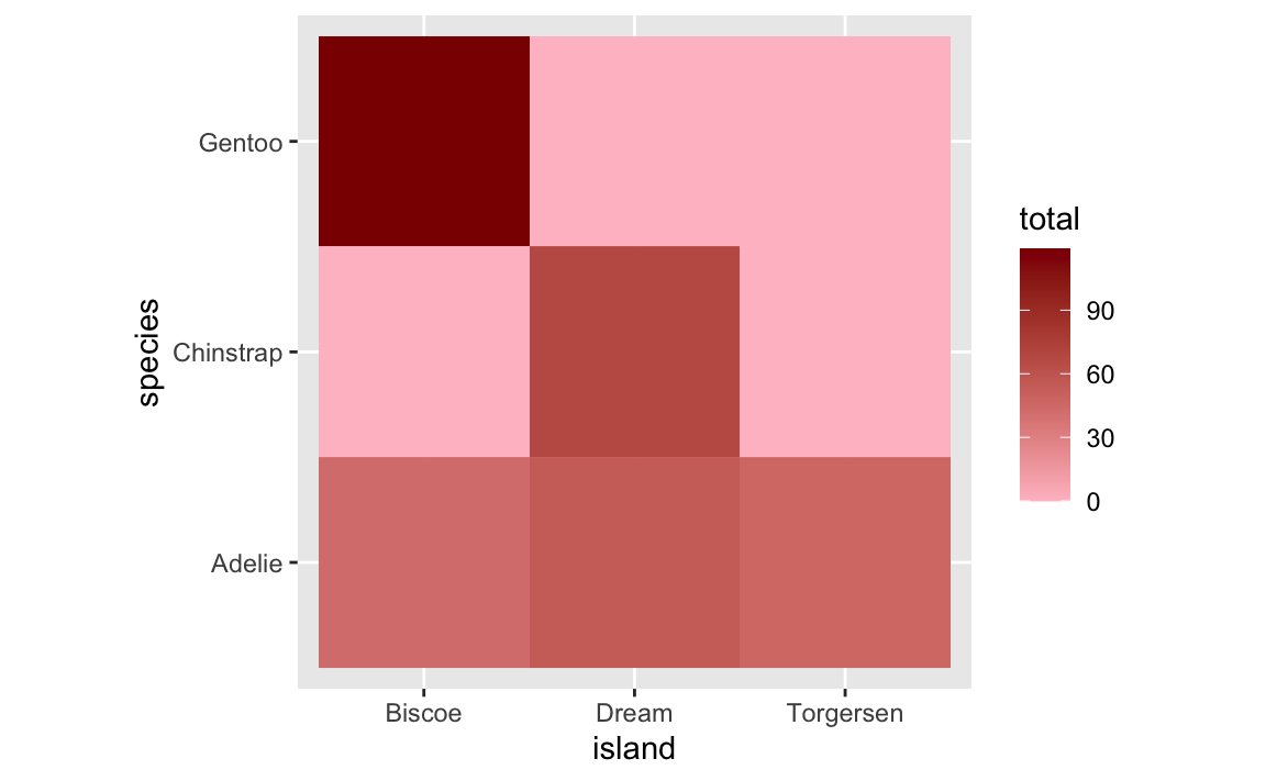
HOWEVER that’s still not quite the ideal solution. The empty titles are filled (good!), but they appear as 0 in the legend (maybe not good!). This stretches out the legend unnecessarily. Recall the first plot that had the empty gaps—the legend went from 50 to 120ish. Now it goes from 0 to 120ish. This bunches up the actual values and compresses the distances between them so that the tiles look too similar to each other. Notice the Adelie row specifically—in the version with the empty titles, there’s good visual contrast across the islands, but in the version with the 0s, all the Adelie tiles are nearly the same shade of pink.
Ideally, we want to (1) fill in the empty tiles but (2) not include 0 in the legend so that the gradient doesn’t get stretched out to include it.
To do this, we can change all the 0s in the summarized data to NA, or missing values:
penguin_heatmap_data_best <- penguins |>
  group_by(island, species, .drop = FALSE) |>
  summarize(total = n()) |>
  # If the total is 0, make it missing, otherwise use the total
  mutate(total = ifelse(total == 0, NA, total))
penguin_heatmap_data_best
## # A tibble: 9 × 3
## # Groups:   island [3]
##   island    species   total
##   <fct>     <fct>     <int>
## 1 Biscoe    Adelie       44
## 2 Biscoe    Chinstrap    NA
## 3 Biscoe    Gentoo      119
## 4 Dream     Adelie       55
## 5 Dream     Chinstrap    68
## 6 Dream     Gentoo       NA
## 7 Torgersen Adelie       47
## 8 Torgersen Chinstrap    NA
## 9 Torgersen Gentoo       NA
Now we have the empty combinations of species and islands, but instead of 0, we have missing values. If we plot it now, ggplot will fill the tiles with missing values with gray. Importantly, the legend doesn’t stretch down to 0.
ggplot(penguin_heatmap_data_best, aes(x = island, y = species, fill = total)) +
  geom_tile() +
  scale_fill_gradient(low = "pink", high = "darkred") +
  coord_equal()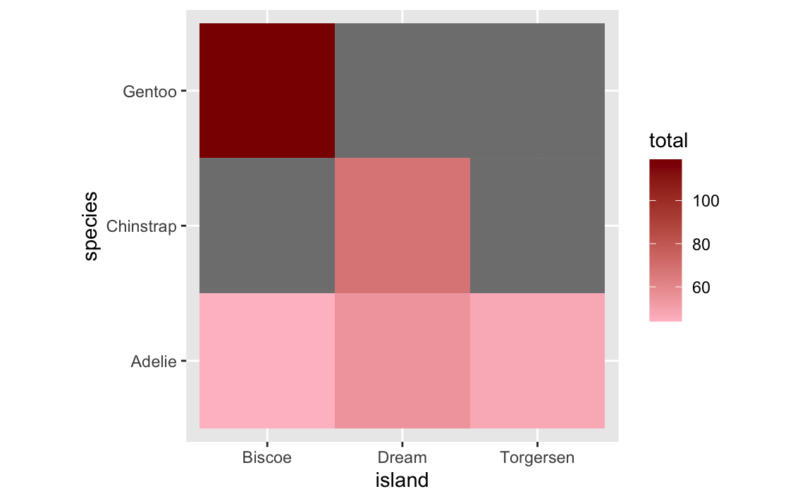
We can control the color of the missing tiles with na.value:
ggplot(penguin_heatmap_data_best, aes(x = island, y = species, fill = total)) +
  geom_tile() +
  scale_fill_gradient(low = "pink", high = "darkred", na.value = "grey90") +
  coord_equal()
This one’s super easy! If you want the columns or lines to go sideways, switch the x and y aesthetics:
penguin_counts <- penguins |>
  group_by(species) |>
  summarize(total = n())
Here are vertical bars:
ggplot(penguin_counts, aes(x = species, y = total)) +
  geom_col()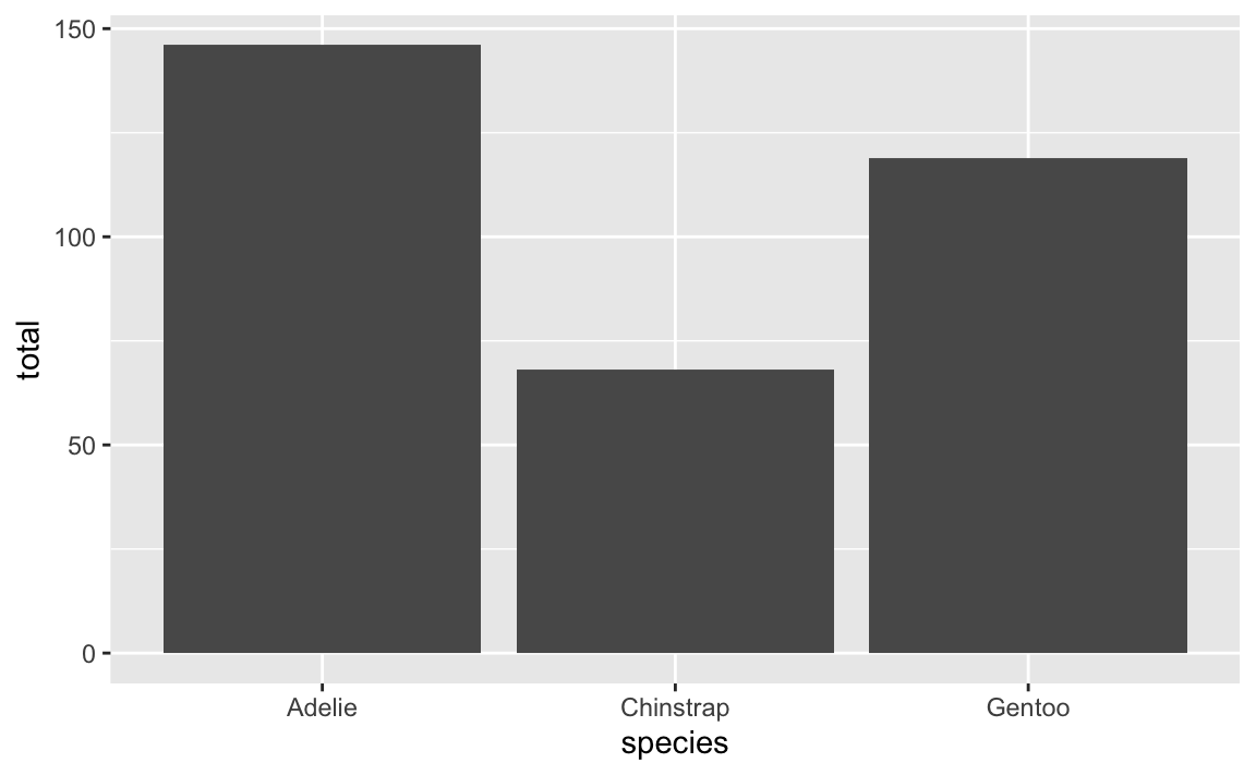
And here are horizontal bars:
ggplot(penguin_counts, aes(x = total, y = species)) +
  geom_col()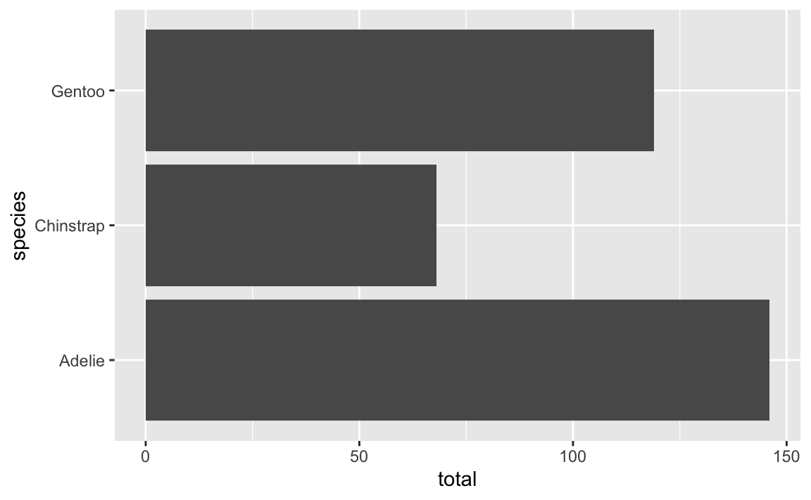
In theory it’s also possible to use coord_flip() to rotate the x and y axes:
ggplot(penguin_counts, aes(x = species, y = total)) +
  geom_col() +
  coord_flip()
But I do not recommend this. For one thing, we told it to put species on the x-axis and now it’s on the y-axis and now we have to remember that. For another thing, coord_flip() doesn’t flip stuff in the legend.
For instance, here’s a lollipop chart with a legend. The legend entries are mini point ranges that are vertical:
ggplot(penguin_counts, aes(x = species, y = total, color = species)) +
  geom_pointrange(aes(ymin = 0, ymax = total))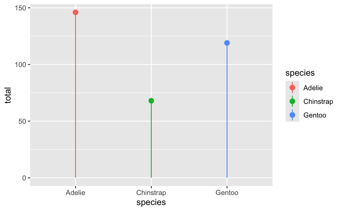
If we flip that with coord_flip(), the plot itself becomes horizontal, but the legend entries are still vertical:
ggplot(penguin_counts, aes(x = species, y = total, color = species)) +
  geom_pointrange(aes(ymin = 0, ymax = total)) +
  coord_flip()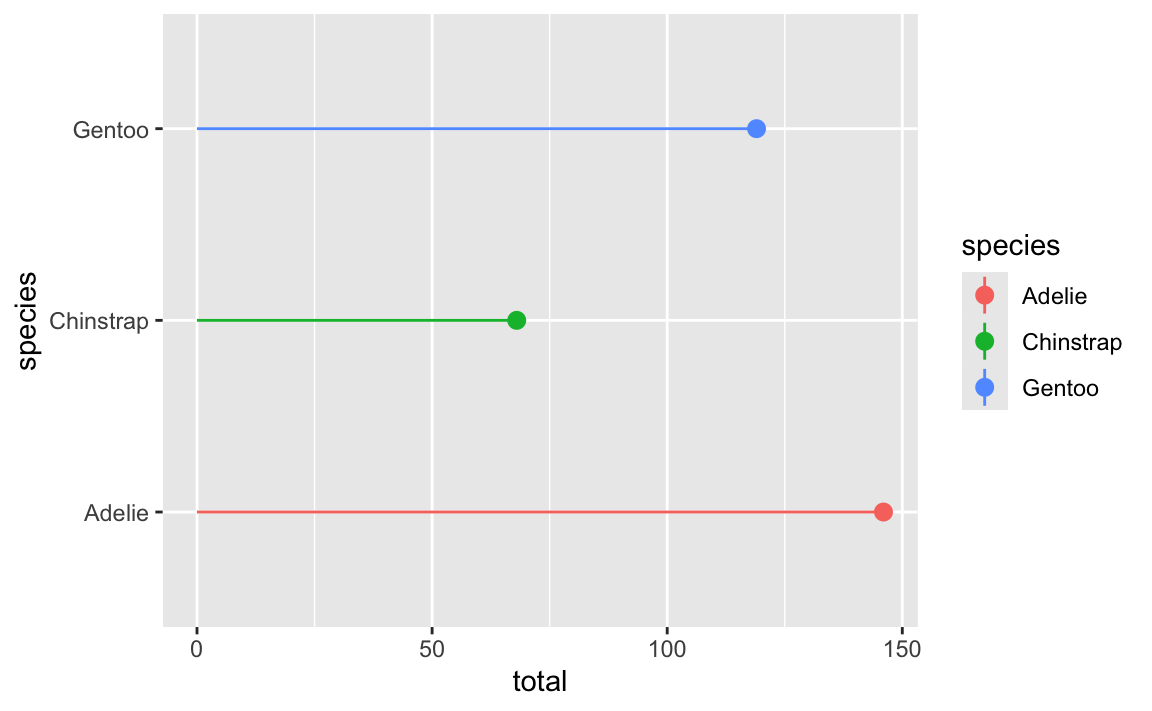
Ew. That breaks the “R” (repetition) in CRAP.
If we swap the x and y aesthetics (and use xmin and xmax instead of ymin and ymax), both the plot and the legend entries will be horizontal:
ggplot(penguin_counts, aes(y = species, x = total, color = species)) +
  geom_pointrange(aes(xmin = 0, xmax = total))
By now you’ve seen ominous looking red text in R, like 'summarise()' has grouped output by 'Gender'. You can override using the '.groups' argument or Warning: Removed 2 rows containing missing values, and so on. You might have panicked a little after seeing this and thought you were doing something wrong.
Never fear! You’re most likely not doing anything wrong.
R shows red text in the console pane in three different situations:
Error in ggplot(...) : could not find function "ggplot", it means that the ggplot() function is not accessible because the package that contains the function (ggplot2) was not loaded with library(ggplot2) (or library(tidyverse), which loads ggplot2). Thus you cannot use the ggplot() function without the ggplot2 package being loaded first.Warning: Removed 2 rows containing missing values (geom_point). R will still produce the scatterplot with all the remaining non-missing values, but it is warning you that two of the points aren’t there.read_csv(). These are helpful diagnostic messages and they don’t stop your code from working. This is what 'summarise()' has grouped output by 'Gender'... is—just a helpful note.Remember, when you see red text in the console, don’t panic. It doesn’t necessarily mean anything is wrong. Rather:
summarise() has grouped output by 'BLAH' when using group_by() and summarize()?See this for a detailed explanation and illustration about what’s going on.
In short, this happens when you use summarize() after grouping by two or more things. When you use summarize() on a grouped dataset, {dplyr} will automatically ungroup the last of the groups and leave everything else grouped.
So if you do this:
essential |>
  group_by(BOROUGH, CATEGORY) |>
  summarize(totalprojects = n())
…R will stop grouping by CATEGORY (since it’s the last specified group) and leave the data grouped by BOROUGH, and you’ll get a message letting you know that that’s the case.
You can turn off those messages for individual chunks if you use message: false in the chunk options. Or alternatively, you can include this line near the top of your document to disable all the warnings:
options(dplyr.summarise.inform = FALSE)In general, you’ll want to try to deal with errors and warnings, often by adjusting or clarifying something in your code. In your final rendered documents, you typically want to have nice clean output without any warnings or messages. You can fix these warnings and messages in a couple ways: (1) change your code to deal with them, or (2) just hide them.
For instance, if you do something like this to turn off the fill legend:
# Not actual code; don't try to run this
ggplot(data = whatever, aes(x = blah, y = blah, fill = blah)) +
  geom_col() +
  guides(fill = FALSE)
You’ll get this warning:
## Warning: The `<scale>` argument of `guides()` cannot be `FALSE`. Use "none"
## instead as of ggplot2 3.3.4.
## This warning is displayed once every 8 hours.
## Call `lifecycle::last_lifecycle_warnings()` to see where this warning was
## generated.
You’ll still get a plot and the fill legend will be gone and that’s great, but the warning is telling you that that code has been deprecated and is getting phased out and will eventually stop working. ggplot helpfully tells you how to fix it: use guides(fill = "none") instead. Changing that code removes the warning and everything will work just fine:
# Not actual code; don't try to run this
ggplot(data = whatever, aes(x = blah, y = blah, fill = blah)) +
  geom_col() +
  guides(fill = "none")
In other cases, though, nothing’s wrong and R is just being talkative. For instance, when you load {tidyverse}, you get a big wall of text:
library(tidyverse)
## ── Attaching core tidyverse packages ─────────────────── tidyverse 2.0.0 ──
## ✔ dplyr     1.1.4     ✔ readr     2.1.5
## ✔ forcats   1.0.0     ✔ stringr   1.5.1
## ✔ ggplot2   3.5.1     ✔ tibble    3.2.1
## ✔ lubridate 1.9.3     ✔ tidyr     1.3.1
## ✔ purrr     1.0.2
## ── Conflicts ───────────────────────────────────── tidyverse_conflicts() ──
## ✖ dplyr::filter() masks stats::filter()
## ✖ dplyr::lag()    masks stats::lag()
## ℹ Use the conflicted package to force all conflicts to become errors
That’s all helpful information—it tells you that R loaded 9 related packages for you ({ggplot2}, {dplyr}, etc.). But none of that needs to be in a rendered document. You can turn off those messages and warnings using chunk options:
```{r}
#| label: load-packages
#| warning: false
#| message: false
library(tidyverse)
```
The same technique works for other messages too. In exercise 3, for instance, you saw this message a lot:
## `summarise()` has grouped output by 'Gender'.
## You can override using the .groups` argument.
That’s nothing bad and you did nothing wrong—that’s just R talking to you and telling you that it did something behind the scenes. When you use group_by() with one variable, like group_by(Gender), once you’re done summarizing and working with the groups, R ungroups your data automatically. When you use group_by() with two variables, like group_by(Gender, Film), once you’re done summarizing and working with the groups, R ungroups the last of the variables and gives you a data frame that is still grouped by the other variables. So with group_by(Gender, Film), after you’ve summarized stuff, R stops grouping by Film and groups by just Gender. That’s all the summarise() has grouped output by... message is doing—it’s telling you that it’s still grouped by something. It’s no big deal.
So, to get rid of the message in this case, you can use message=FALSE in the chunk options to disable the message:
```{r}
#| label: lotr-use-two-groups
#| message: false
lotr_gender_film <- lotr |>
  group_by(Gender, Film) |>
  summarize(total = sum(Words))
```At the end of exercise 4, you created a heatmap showing the proportions of different types of construction projects across different boroughs. In the instructions, I said you’d need to use group_by() twice to get predictable proportions. Some of you have wondered what this means. Here’s a quick illustration.
When you group by a column, R splits your data into separate datasets behind the scenes, and when you use summarize(), it calculates summary statistics (averages, counts, medians, etc.) for each of those groups. So when you used group_by(BOROUGH, CATEGORY), R made smaller datasets of Bronx Affordable Housing, Bronx Approved Work, Brooklyn Affordable Housing, Brooklyn Approved Work, and so on. Then when you used summarize(total = n()), you calculated the number of rows in each of those groups, thus giving you the number of projects per borough per category. That’s basic group_by() |> summarize() stuff.
Once you have a count of projects per borough, you have to decide how you want to calculate proportions. In particular, you need to figure out what your denominator is. Do you want the proportion of all projects within each borough (e.g. X% of projects in the Bronx are affordable housing, Y% in the Bronx are approved work, and so on until 100% of the projects in the Bronx are accounted for), so that each borough constitutes 100%? Do you want the proportion of boroughs for each project (e.g. X% of affordable housing projects are in the Bronx, Y% of affordable housing projects are in Brooklyn, and so on until 100% of the affordable housing projects are accounted for). This is where the second group_by() matters.
For example, if you group by borough and then use mutate to calculate the proportion, the proportion in each borough will add up to 100%. Notice the denominator column here—it’s unique to each borough (1169 for the Bronx, 2231 for Brooklyn, etc.).
essential |>
  group_by(BOROUGH, CATEGORY) |>
  summarize(totalprojects = n()) |>
  group_by(BOROUGH) |>
  mutate(denominator = sum(totalprojects),
         proportion = totalprojects / denominator)
#> # A tibble: 33 × 5
#> # Groups:   BOROUGH [5]
#>    BOROUGH  CATEGORY               totalprojects denominator proportion
#>    <fct>    <fct>                          <int>       <int>      <dbl>
#>  1 Bronx    Affordable Housing                80        1169   0.0684
#>  2 Bronx    Approved Work                    518        1169   0.443
#>  3 Bronx    Homeless Shelter                   1        1169   0.000855
#>  4 Bronx    Hospital / Health Care            55        1169   0.0470
#>  5 Bronx    Public Housing                   276        1169   0.236
#>  6 Bronx    Schools                          229        1169   0.196
#>  7 Bronx    Utility                           10        1169   0.00855
#>  8 Brooklyn Affordable Housing               168        2231   0.0753
#>  9 Brooklyn Approved Work                   1223        2231   0.548
#> 10 Brooklyn Hospital / Health Care            66        2231   0.0296
#> # … with 23 more rows
If you group by category instead, the proportion within each category will add to 100%. Notice how the denominator for affordable housing is 372, approved work is 4189, and so on.
essential |>
  group_by(BOROUGH, CATEGORY) |>
  summarize(totalprojects = n()) |>
  group_by(CATEGORY) |>
  mutate(denominator = sum(totalprojects),
         proportion = totalprojects / denominator)
#> # A tibble: 33 × 5
#> # Groups:   CATEGORY [7]
#>    BOROUGH  CATEGORY               totalprojects denominator proportion
#>    <fct>    <fct>                          <int>       <int>      <dbl>
#>  1 Bronx    Affordable Housing                80         372      0.215
#>  2 Bronx    Approved Work                    518        4189      0.124
#>  3 Bronx    Homeless Shelter                   1           5      0.2
#>  4 Bronx    Hospital / Health Care            55         259      0.212
#>  5 Bronx    Public Housing                   276        1014      0.272
#>  6 Bronx    Schools                          229        1280      0.179
#>  7 Bronx    Utility                           10          90      0.111
#>  8 Brooklyn Affordable Housing               168         372      0.452
#>  9 Brooklyn Approved Work                   1223        4189      0.292
#> 10 Brooklyn Hospital / Health Care            66         259      0.255
#> # … with 23 more rows
You can also ungroup completely before calculating the proportion. This makes it so the entire proportion column adds to 100%:
essential |>
  group_by(BOROUGH, CATEGORY) |>
  summarize(totalprojects = n()) |>
  ungroup() |>
  mutate(denominator = sum(totalprojects),
         proportion = totalprojects / denominator)
#> # A tibble: 33 × 5
#>    BOROUGH  CATEGORY               totalprojects denominator proportion
#>    <fct>    <fct>                          <int>       <int>      <dbl>
#>  1 Bronx    Affordable Housing                80        7209   0.0111
#>  2 Bronx    Approved Work                    518        7209   0.0719
#>  3 Bronx    Homeless Shelter                   1        7209   0.000139
#>  4 Bronx    Hospital / Health Care            55        7209   0.00763
#>  5 Bronx    Public Housing                   276        7209   0.0383
#>  6 Bronx    Schools                          229        7209   0.0318
#>  7 Bronx    Utility                           10        7209   0.00139
#>  8 Brooklyn Affordable Housing               168        7209   0.0233
#>  9 Brooklyn Approved Work                   1223        7209   0.170
#> 10 Brooklyn Hospital / Health Care            66        7209   0.00916
#> # … with 23 more rows
Which one you do is up to you—it depends on the story you’re trying to tell.
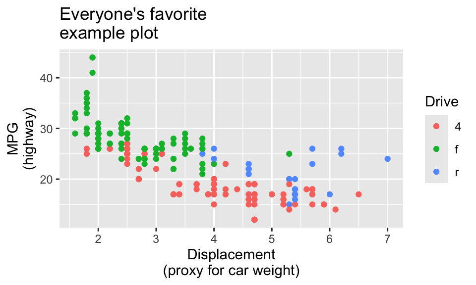
If you don’t want to use the fancier techniques from the blog post about long labels, a quick and easy way to deal with longer text is to manually insert a linebreak yourself. This is super easy: include a \n where you want a new line:
ggplot(data = mpg, mapping = aes(x = displ, y = hwy, color = drv)) +
  geom_point() +
  labs(
    title = "Everyone's favorite\nexample plot",
    x = "Displacement\n(proxy for car weight)",
    y = "MPG\n(highway)",
    color = "Drive"
  )
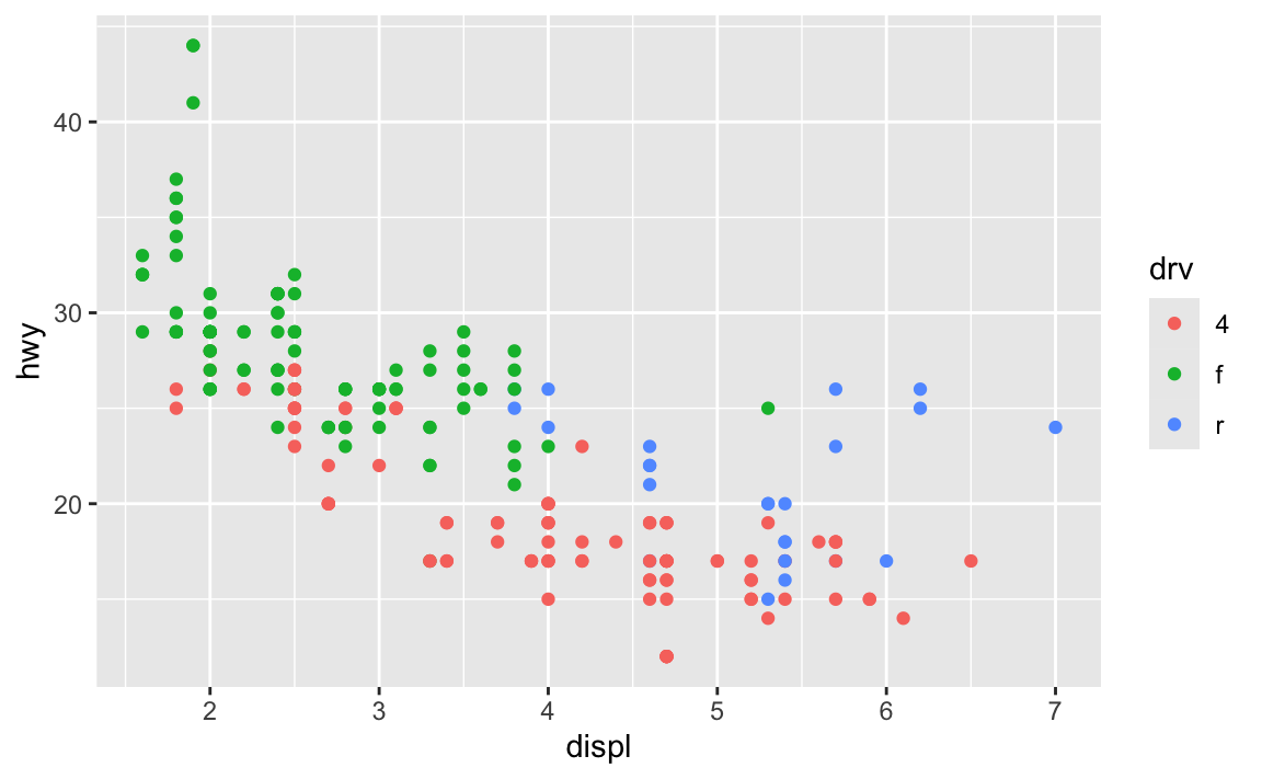
By default, R creates plots that are 7″×7″ squares:
library(tidyverse)

ggplot(data = mpg, mapping = aes(x = displ, y = hwy, color = drv)) +
  geom_point()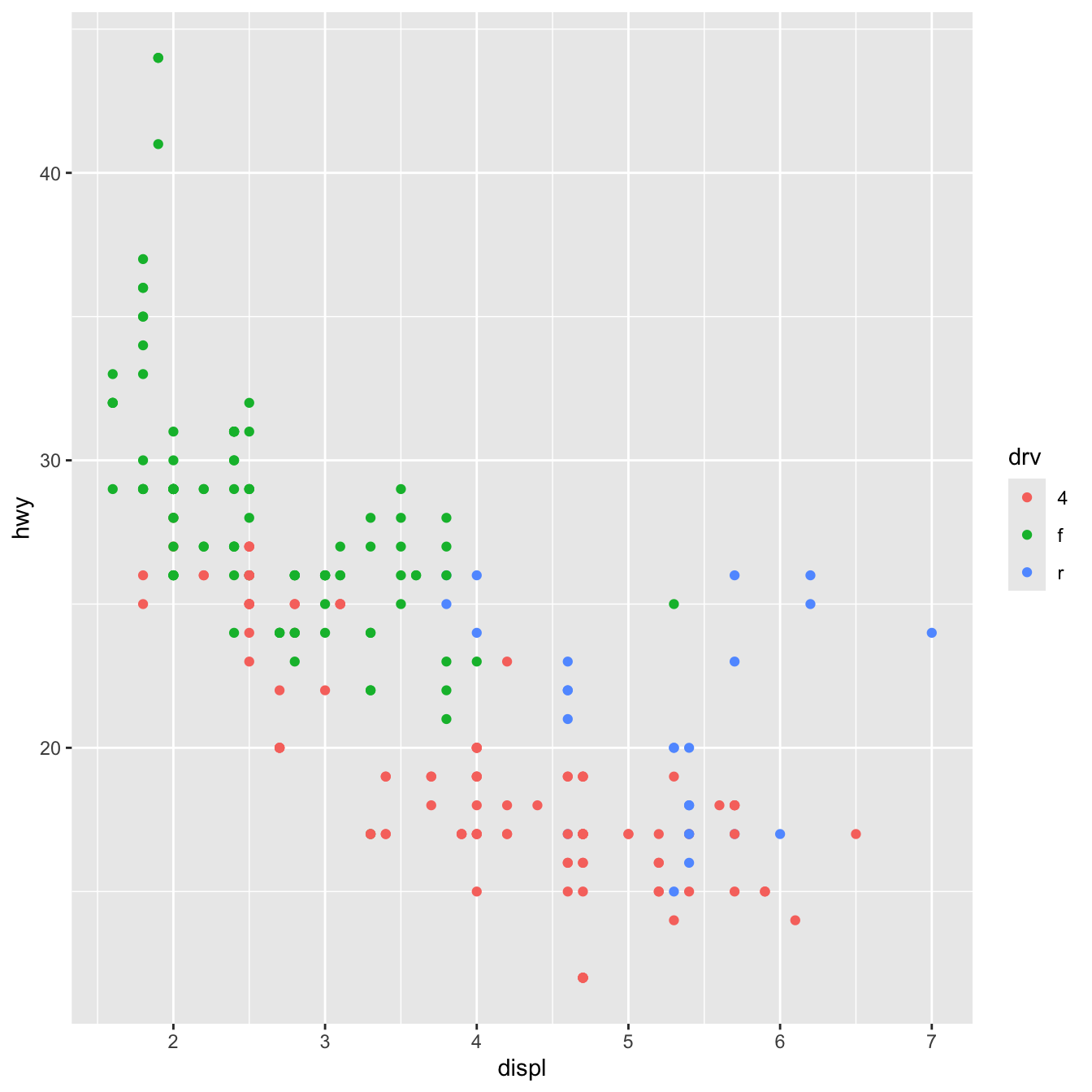
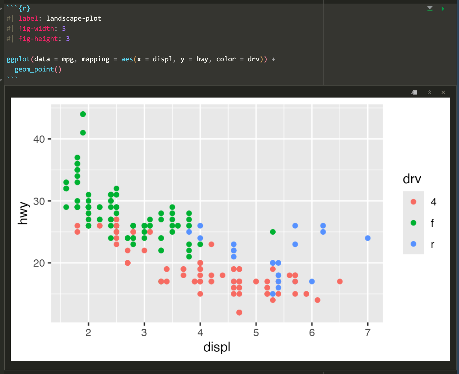
Often, though, those plots are excessively large and can result in text that is too small and dimensions that feel off. You generally want to have better control over the dimensions of the figures you make. For instance, you can make them landscape when there’s lots of text involved. To do this, you can use the fig-width and fig-height chunk options to control the, um, width and height of the figures:
```{r}
#| label: landscape-plot
#| fig-width: 5
#| fig-height: 3

ggplot(data = mpg, mapping = aes(x = displ, y = hwy, color = drv)) +
  geom_point()
```
The dimensions are also reflected in RStudio itself when you’re working with inline images, so it’s easy to tinker with different values and rerun the chunk without needing to re-render the whole document over and over again:
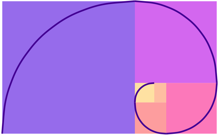
Because I’m a super nerd, I try to make the dimensions of all my landscape images be golden rectangles, which follow the golden ratio—a really amazing ancient number that gets used all the time in art and design. Check out this neat video or this one to learn more.
Basically, a golden rectangle is a special rectangle where if you cut it at a specific point, you get a square and a smaller rectangle that is also a golden rectangle. You can then cut that smaller rectangle at the magic point and get another square and another even smaller golden rectangle, and so on.
More formally and mathematically, it’s a rectangle where the ratio of the height and width of the subshapes are special values. Note how here the blue square is a perfect square with side lengths a, while the red rectangle is another smaller golden rectangle with side lengths a and b:
\[ \frac{a + b}{a} = \frac{a}{b} = \phi \]
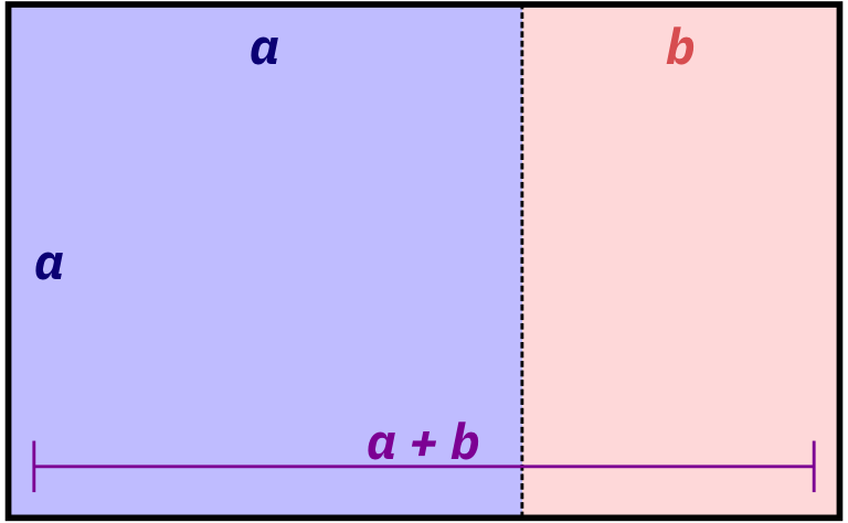
It turns out that if you do the algebra to figure out that ratio or \(\phi\) (the Greek letter “phi,” pronounced as either “fee” or “fie”), it’s this:
\[ \phi = \frac{1 + \sqrt{5}}{2} \approx 1.618 \]
That’s all really mathy, but it’s really just a matter of using that 1.618 number with whatever dimensions you want. For instance, if I want my image to be 6 inches wide, I’ll divide it by \(\phi\) or 1.618 (or multiply it by 0.618, which is the same thing) to find the height to make a golden rectangle: 6 inches × 0.618 = 3.708 = 3.7 inches
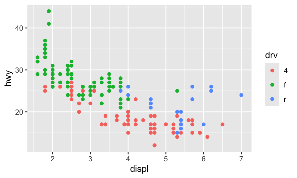
R can even do the math for you in the chunk options if you use fig-asp:
```{r}
#| label: landscape-plot-golden
#| fig-width: 6
#| fig-asp: 0.618

ggplot(data = mpg, mapping = aes(x = displ, y = hwy, color = drv)) +
  geom_point()
```
If you can’t remember that the magic golden ratio \(\phi\) is 1.618 or the gross complicated \(\frac{1 + \sqrt{5}}{2}\), you can cheat a little and remember \(\frac{5}{3}\), which is 1.667, which is often close enough.
I don’t do this with all my figures, and I often have to fudge the numbers a bit when there are titles and subtitles (i.e. making the height a little taller so that the rectangle around just the plot area still roughly follows the golden ratio), but it makes nice rectangles and I just think they’re neat.
For bonus fun, if you draw a curve between the opposite corners of each square of the golden rectangles, you get something called the golden spiral or Fibonacci spiral, which is replicated throughout nature and art. Graphic designers and artists often make the dimensions of their work fit in golden rectangles and will sometimes even overlay a golden spiral over their work and lay out text and images in specific squares and rectangles. See this and this for some examples.